A common critique of buying something on Etsy is how challenging it can be to find exactly what you’re looking for. Up until recently, buyers mostly had to rely on text searches instead of filters; there were very few ways to effectively narrow what you were looking at. In 2017, we made huge strides in collecting information from sellers in a structured way, which we could then use to power search filters. I was responsible for designing the way we’d collect this information from sellers on each of their listings.
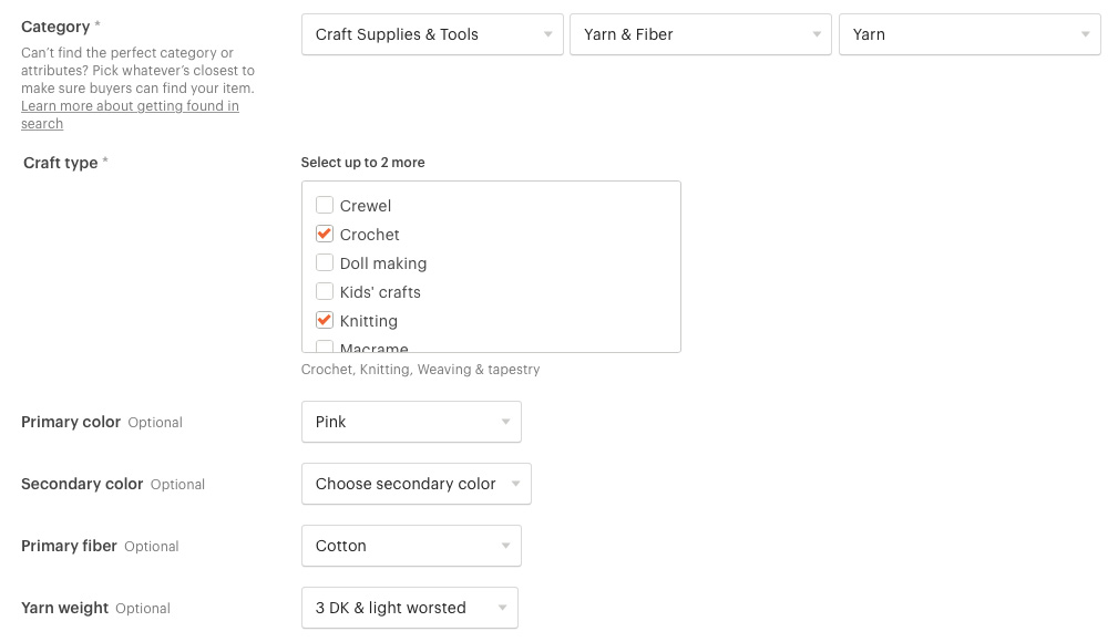
A listing category and category-specific structured data
Historical context
There are certain standards for a search experience on most ecommerce sites. You’d expect filters, faceting, and robust tools for narrowing down what you’re looking at to find the perfect item. Having quality, structured information about each item isn’t an issue for most sites, since typically these places manufacture and own their inventory, so that information is readily available and easy to populate. This makes searching and filtering rather straightforward.
Etsy is a marketplace comprised of the inventory of over a million shops; Etsy doesn’t own any of the inventory. In order to power search, we rely on the data that sellers give us. And the search experience is only as good as the data that we have. For the past 12 years, the information that we collected from sellers in the listing form had been largely unstructured. There was some intentionality behind this; since Etsy is a marketplace for unique, one-of-a-kind items, we can’t predict what people will design or want to sell. This is what makes Etsy and its sellers so special, but it can make collecting information in a structured way pretty difficult.
We’d made some attempts in the past to collect structured information. For a few years, we had three fields, “style”, “recipient”, and “occasion” that appeared on every listing. Each had a dropdown with a number of options to choose from, such as “goth” or “boho” for style, and “birthday” or “Valentine’s Day” for occasion. The plan was for these fields to power search and browse pages eventually, but we never hit a critical mass of listings with these fields filled out. Sellers were waiting for those fields to actually power search to fill them out since they weren’t sure how it would impact the findability of their items. They also felt that the fields were too broad and not tailored to their items enough. There was a huge chicken-egg problem. To work really well in search, our structured data needed to be specific to the category a seller listed her item in.
Our approach
In the early days of research for our newest marketplace for craft supplies, Etsy Studio, we learned filters were incredibly important for craft supply shoppers, since they were often looking for something very specific (such as yarn of a certain weight, or a bead of a certain dimension) to do a specific craft. We saw the launch of this new marketplace as an opportunity to start collecting structured data from sellers the right way and to finally add filters to search. So, we started the project by focusing on craft supplies.
From the beginning, the work on the seller side was a close collaboration with our Structured Data team. My team was responsible for building the form fields sellers used to fill out the data on the listing form, and the Structured Data team provided all of the data to power each of the fields. We collaborated closely with taxonomists, who built out the elaborate list of structured data fields (which we called attributes) for items in each node of the craft supplies taxonomy.
Once we had a first pass at a taxonomy with attributes, we saw that most attributes would fall into one of four form field types: select from a list, yes/no, input with unit, and numerical input.
Select from a list was the most common. This was for attributes with a predictable or common set of responses. For example, we’d ask about the fiber type for fabric, or the weight of yarn. This also applied to attributes like color, pattern, and material.
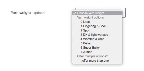
Selects were used for a list of common responses
Yes/no attributes were used for common things buyers might want to filter by or exclude in their search. On some taxonomy nodes, we’d ask things like, “Is this organic?”, “Is this art yarn?”, or “Is this hand-painted?”.

Radios were used for yes/no responses
Input with unit was for collecting measurements. The input had to be a number, and then we provided a set of units to choose from, such as inches or yards. This was helpful for nodes like fabric, where sellers could input length and width, or beads, where sellers could specify the bead diameter and hole width.

Inputs with a unit were used for measurements
Finally, numerical input was used for integers like the number of strands for beads or the number of skeins for yarn.

Inputs were used for numbers
Attributes and variations
At the same time that we were adding structured data to the listing form, we were overhauling the way that inventory worked on Etsy, specifically a part of the form called variations. Variations are a tool used to enumerate all of the options sellers have for sale of a given product; often, these variations are different sizes, colors, finishes, fabrics, or measurements that the seller offers. Sound familiar? The defining characteristics of an item, or its attributes, are also probably the things of which a seller might offer variations. If you’re selling hand-dyed yarn, Etsy wants to know what the color of the yarn is and its weight, and those might also be different options that a buyer can choose from when purchasing. There needed to be some kind of connection between attributes and variations.
We had talked for a long time about having a better list of variation types from which a seller could choose when adding variations. Since variations was initially launched in 2012, we had used the same generic list of variation types (color, size, flavor, device, scent, length, etc.) regardless of the category the item was listed in. This meant that sellers could add “device” as a variation for a shoe, or “flavor” as a variation for a chair. Again, because it’s Etsy, we couldn’t possibly predict the types of items that someone might sell, but having variation types like device show up when you’re selling shoes was adding a lot of noise to the flow.
The way sellers entered all of their variation options was also, for the most part, free-form text with little validation. Since the data wasn’t that great we couldn’t reliably use it in search, so variations had historically not been factored into search at all. This felt like a huge missed opportunity for helping buyers find the right items.
We decided to use attributes to power variations. We updated the list of variation types to be the same as the list of attributes for a given item, and we used the same style of entering in the attribute values (select from a list, input with unit, numerical input) for entering in the variation options. Applying the same structured data collection to variations meant that we were able to use a seller’s variations data in search.

The options for filling out an attribute
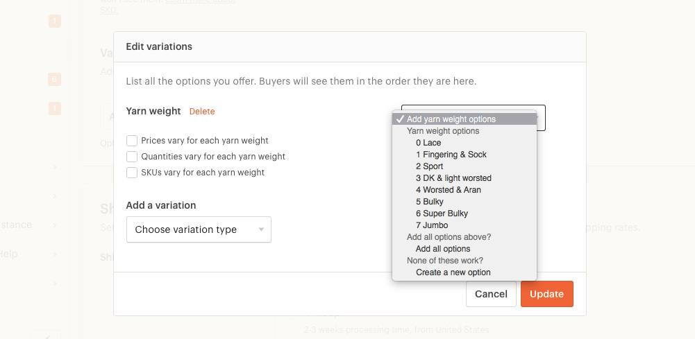
The same attribute options were also used in variations
To establish the relationship between attributes and variations, we gave sellers a way to mark an attribute as a variation. If a seller was filling out the form and encountered an attribute which was a variation, they could select “I offer more than one” at the top of the form. When they got to the variations section, we’d already have that variation added; all they had to do was add each of the options they offered.

A seller could indicate that an attribute was a variation by selecting "I offer more than one"
Validating our work
Once we had defined an early version of the taxonomy with attributes, we got to usability testing. We knew sellers would have a lot of feedback about attributes, since we know how deeply sellers care about the way search works on Etsy and how findable their items are. Categorization is also a very personal topic for many sellers, and as experts on their items, we knew they’d have a lot of feedback about the different values they could select for each attribute. We went into usability testing hoping for feedback on two topics: the taxonomy and the attributes themselves, and the relationship between attributes and variations.
To get the best feedback possible, I worked closely with an engineer to build an interactive HTML prototype of the listing form that demonstrated the connection between attributes and variations. We also worked with our taxonomists to power the prototype with the work-in-progress taxonomy and attributes. For each seller that we recruited, we looked at their shop to see what their top item category was, then built out a version of the listing form tailored to that category. By making things as realistic as possible for a seller’s items, we were able to get really specific feedback on the taxonomy and attributes. It also helped us gain confidence in the interactions and messaging around filling out attributes and variations.
We consistently heard two main pieces of feedback around the listing form. One, that there should be an additional type of form field for attributes: multiselect. This would be helpful for attributes like “holiday” or “craft”, where sometimes there isn’t just one answer. Two, that this was going to represent a LOT of work for sellers.
Adding attributes to each listing was going to be a huge win for search. In research, sellers were enthusiastic that they had a designated place to put these important details about their items and that it was going to help them in search. But every time we add form fields to the listing form, it adds more work for sellers. They told us that they’d do the work to update their listings because they knew it was important, but they were concerned about how much time it would take to update every single listing. We needed to build a tool that sellers could use at launch to help them with this work.
Creating a launch tool
There were a lot of different directions a launch tool could take. We decided to set some targets and constraints to keep things as simple as possible. We wanted to target high volume sellers, since we knew that this launch would be the most stressful for those sellers; some of our craft supply sellers have thousands of items in their shops! We considered building tooling to edit listings in bulk, but thought it could be more trouble than it was worth; the many connections between attributes, categories, and variations felt like there were too many opportunities to accidentally overwrite data. So, we decided to build a tool that isolated all of the new fields and helped sellers go through listings one-by-one to fill out the new details.
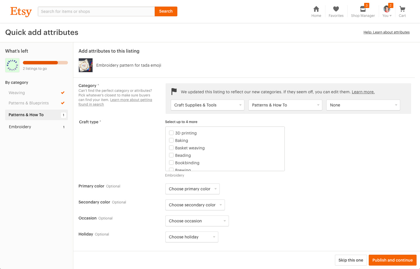
The attributes launch tool for my Etsy shop
For each listing, sellers had two options: fill out attributes and publish the listing, or skip the listing and come back to it later. We added a skip feature so sellers didn’t have to fill out listings they weren’t ready to fill out and we could keep forward progress going. Since we wanted sellers to fill out attributes for every listing, we used common cues from onboarding flows to indicate how much progress they’ve made. A progress bar shows how many listings they’ve completed, and we added numbers next to each category to show how many listings were in each. Sellers could come back to the tool at any time and we’d save their progress; in research, sellers told us that this work could take a few sessions to complete.
The easiest way for a seller to go through all of their listings was going to be by category. Since attributes are category-specific, a seller would be filling out the same types of fields over and over for each listing; hopefully that would help speed the process up. We listed every taxonomy node a seller had items in on the left-hand side of the screen, like navigation. By default the tool would take you through each category in order, or you could jump to a specific category in the navigation.

A banner displayed in the Listings Manager when a seller had started adding attributes
Finally, we added banners to the listings manager, where sellers maintain their listings, to indicate that there was a tool they could use to quickly fill out attributes. After a seller used the tool for the first time, we updated the banners with the progress bar to show how many listings were left.
Launch and reception
Before our full launch, we used the same seller prototype as the inventory management project to beta test attributes with sellers. These sellers helped us find bugs, refine the attributes, and even helped us test the launch tool before we released it to all sellers.
When we announced the launch of Etsy Studio, we also announced that attributes were coming to listings to power search on Etsy Studio and eventually Etsy, and released the launch tool. Sellers had a period of time to update their listings before the public launch of Etsy Studio.
After the launch of attributes, our buyer-side team was able to start the work of implementing filters on Etsy. Even though filters didn’t yet exist on Etsy, in our launch communications we told sellers that we would be updating search, which was enough to gain adoption on a significant number of listings.
Overall the reception of structured data was positive, with a lot of (expected) mixed feedback on the taxonomy and attributes themselves. The addition of a launch tool was a huge relief to many sellers and had a positive impact on structured data adoption.
Project details
Role
Lead designer, front-end development
Core team
1 product manager, 1 engineering manager, 7 engineers, 1 product marketing manager, 1 product education specialist
Released
February 2017
View live
Listings Manager (for Etsy sellers only)