In September 2020 we launched a multichannel rebrand of Primary: a new logo, new brand styleguide, fresh packaging, and an updated website.
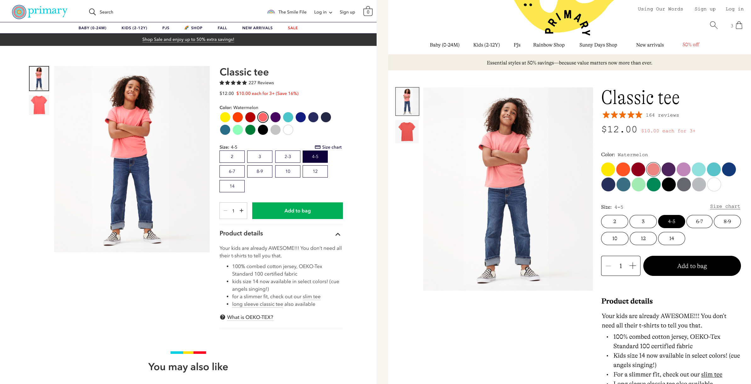
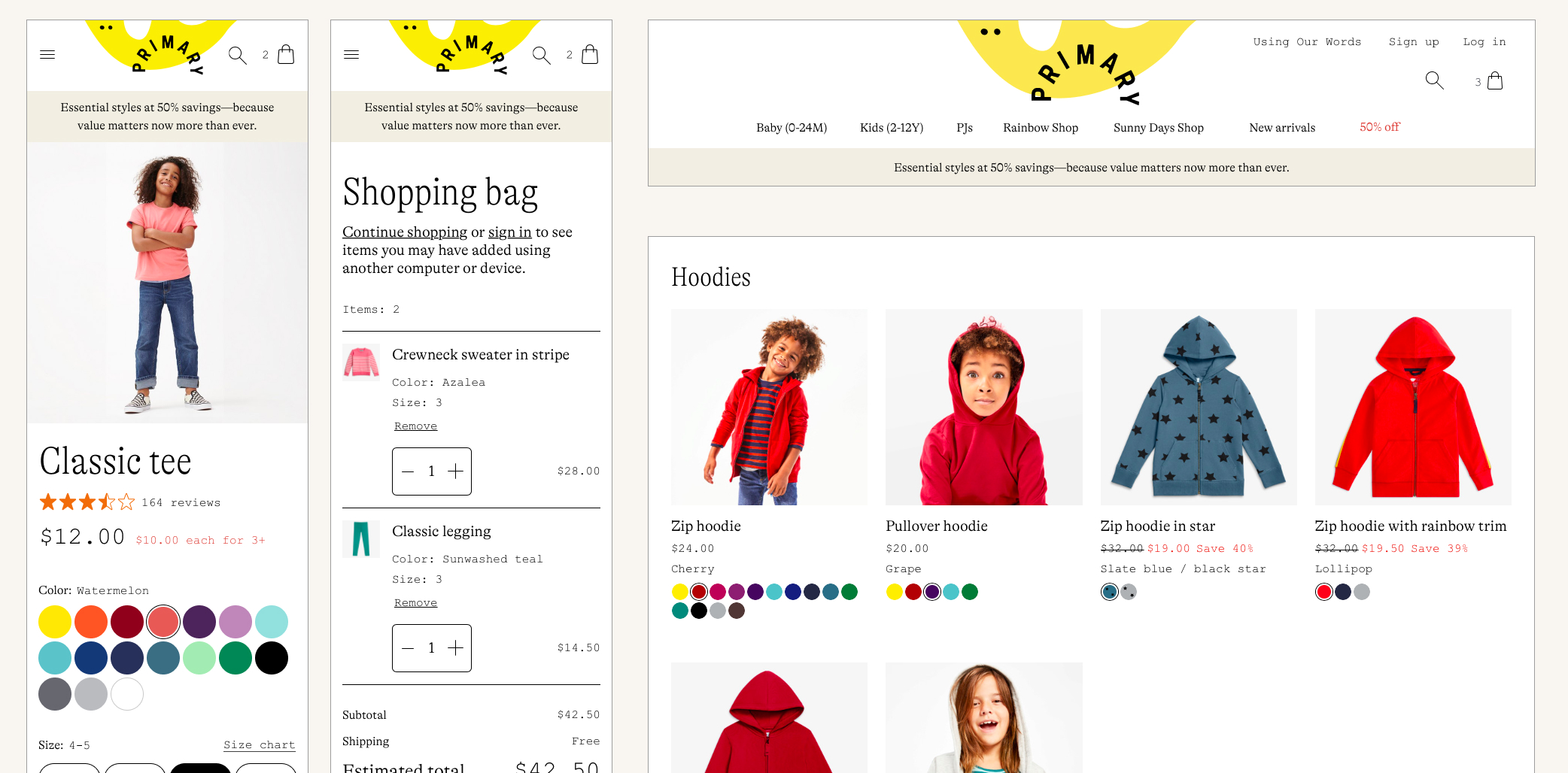
On the left, the old product detail page, and on the right, the brand refreshed version.
Our goal was to coordinate the launch across web, marketing, and (physical) product, so that a customer who placed an order on the brand refreshed website would receive a product with the updated logo and packaging. On the web, we wanted to maintain the existing functionality as much as possible; we were focused on updating the aesthetics instead of totally rethinking the way things worked. We also wanted to ensure that the new design system met AA accessibility standards from the start. I led the design of the updated website, including leading the design and implementation of a new, accessible design system.
Historical context
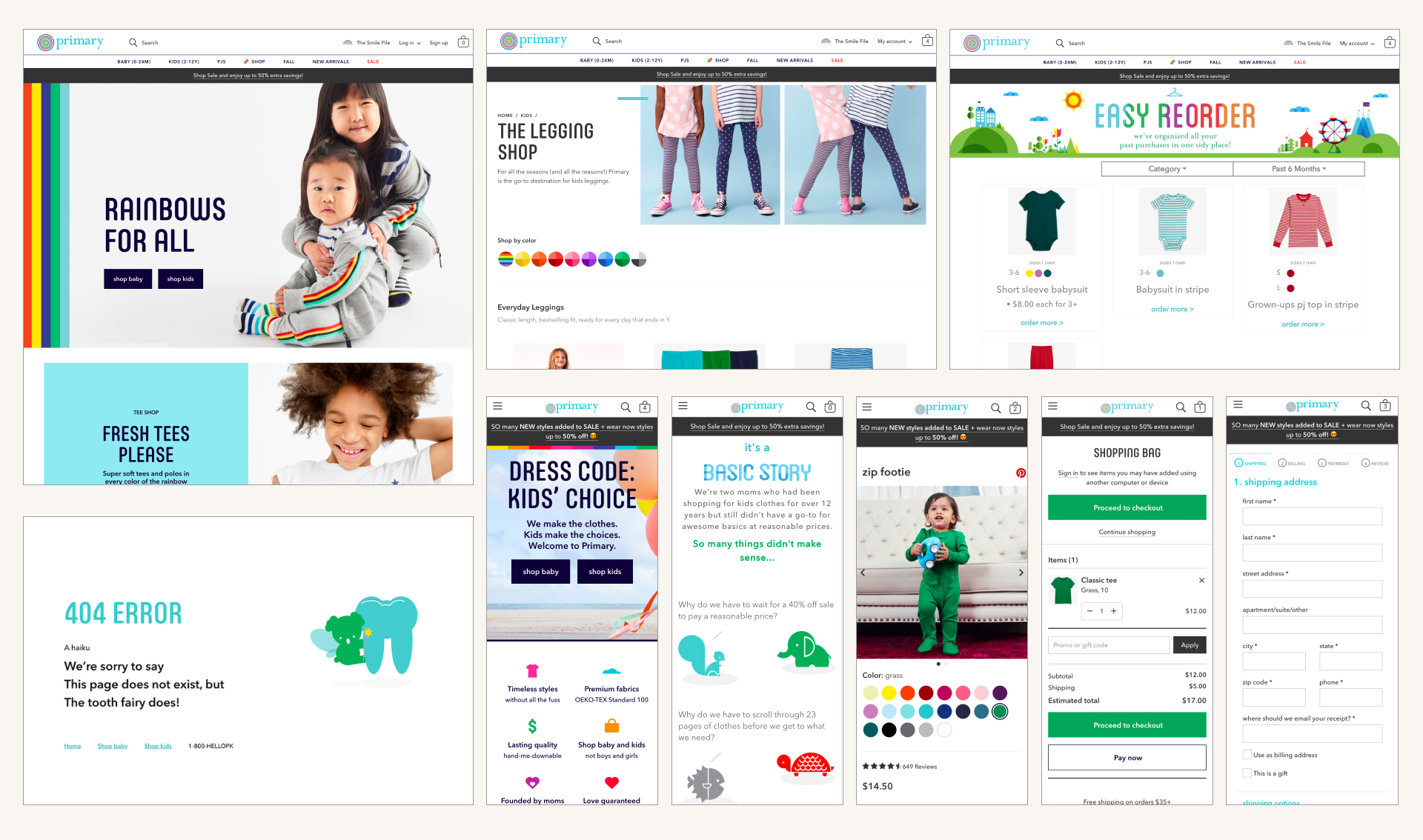
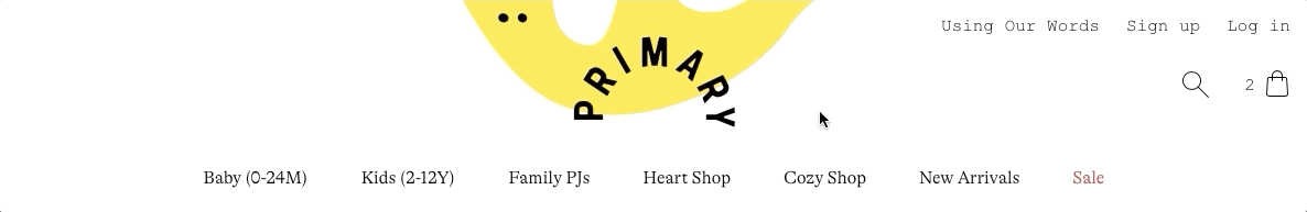
Examples of the website before the brand refresh.
When Primary launched in 2015, the focus was on basic staples that would be the foundation of a kid’s wardrobe. Over time, the product offerings expanded to include more seasonal items, a palette of over 60 different shades, and enormously popular novelty prints. Meanwhile, the values and the mission of Primary sharpened as the company found its voice and core customer base. However, the logo and visual language hadn’t evolved to match where the brand was going. We had a lot that we wanted to say, but we didn’t have the right system in place to say it clearly.
In early 2020, the company’s leadership team kicked off the rebrand process with Collins to update the logo, colors, typefaces, illustration, photography, and brand voice. Our goal was to launch the rebrand in early September 2020, just in time for our peak shopping season.
Kicking off the rebrand
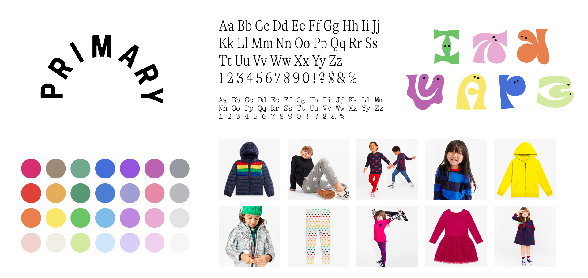
Collins designed a new logo and defined new colors, type, illustration, and photography style.
Collins’ new logo and visual style were inspired by children’s storybooks in the ’50s and ’60s and was sophisticated but still playful. Once the leadership team and Collins had settled on this direction, they expanded the process to involve Primary’s art directors, copywriters, and me. With the high-level direction settled on, it was time for those of us closer to the work to provide feedback and start stress-testing the brand guidelines. My job was to figure out how the new brand guidelines would work on the website.
Collins delivered a brand book that covered fundamental guidelines like color, type, photography, illustration, and layout, as well as example applications of the guidelines. The focus of the brand book was mostly on print and marketing materials, and while there were a few example website mockups, there was still a lot to be determined about how the brand guidelines should extend to the web. Once the Collins team walked us through the guidelines, I began exploring how to translate the brand to the web by focusing on our most important and complicated pages: the product detail page, the product list page, and the navigation.
Applying the rebrand to the web
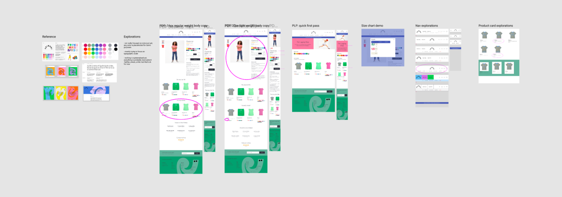
Really, really early design explorations. I shared explorations like these in critique, and we'd circle what was working.
Starting with the product detail page, I explored typography scales, button styles, page hierarchy, and more, while keeping roughly the same layout and content as the current site. When I hit a stopping point, I shared the mockups for feedback with the design team, and we circled elements that were working and talked about what felt on or off brand and why. We also had regular meetings with Collins to share our explorations with their creative director and lead designer for feedback. These meetings were super useful for understanding their vision with the brand and for figuring out how to apply the guidelines to some of the hairier situations on web.
Through all of the explorations and the critiques, we started to solidify how the brand should work on web:
Typography
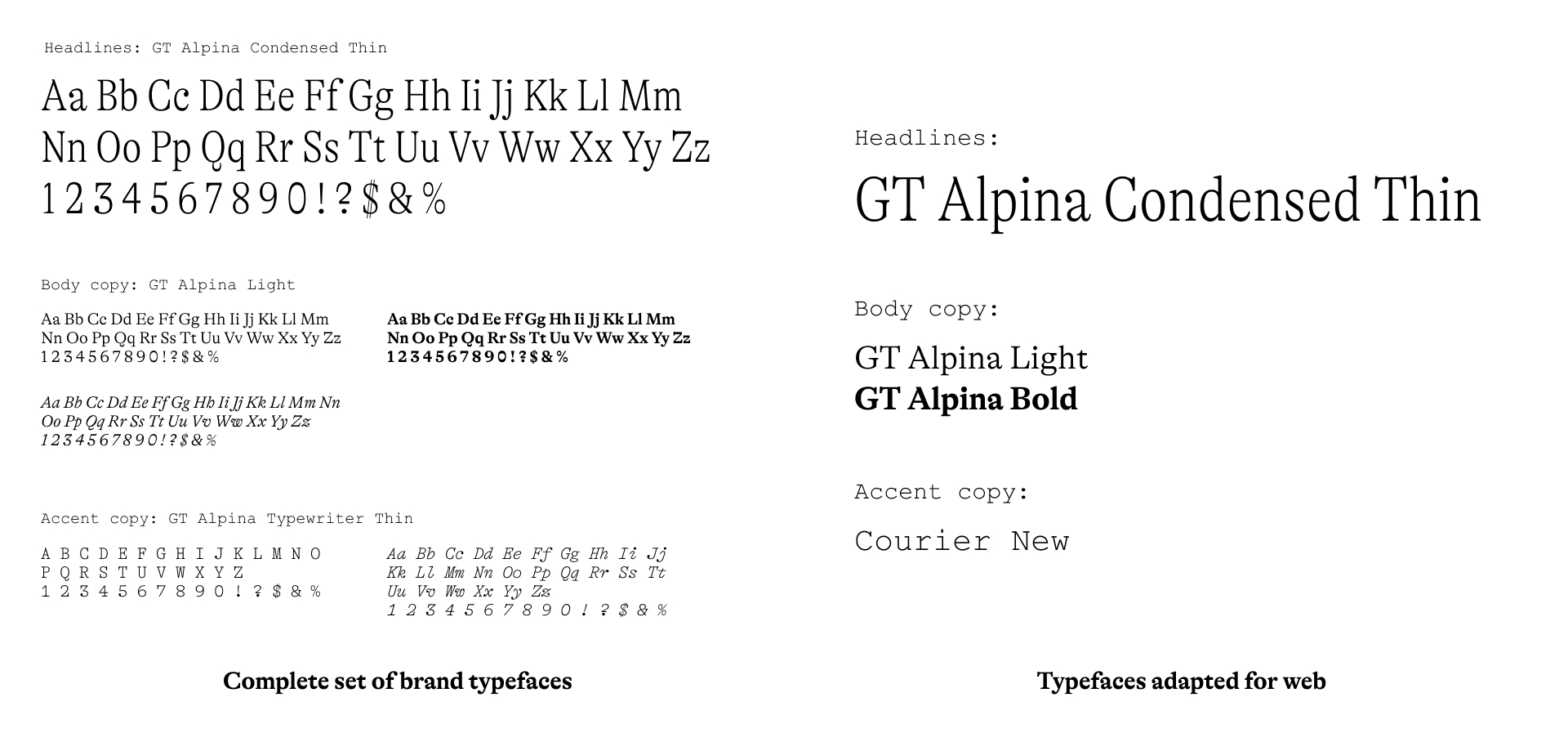
I slimmed down the number of custom typefaces to three weights for headlines and body and chose a web-safe alternative for accents.
Collins chose GT Alpina as our new brand typeface and picked out different weights and styles for headlines (Condensed Thin), body copy (Light, Bold, and Light Italic), and accents (Typewriter Thin and Typewriter Italic). In total, the new system used six different weights. On web, the more custom (non-system default) typefaces you have, the longer it can take to load the website, and for an ecommerce site, long page load times can have a negative effect on conversion rate. I slimmed down the number of typefaces for web from six to three (Condensed Thin, Light, and Bold) for headlines and body text, then chose Courier New as a web-safe replacement for the typewriter style. This way, the majority of text on the site would be consistent with our other channels, and we could also be mindful of page load times.
Icons
Examples of icons needed for the website UI.
While the new brand kept icon use to a minimum, there were still situations in which we’d need icons, like arrows, close icons, and navigation elements. I found icon sets that fit the new aesthetic and worked with Collins to choose the best match, landing on Light Streamline.
Color palette
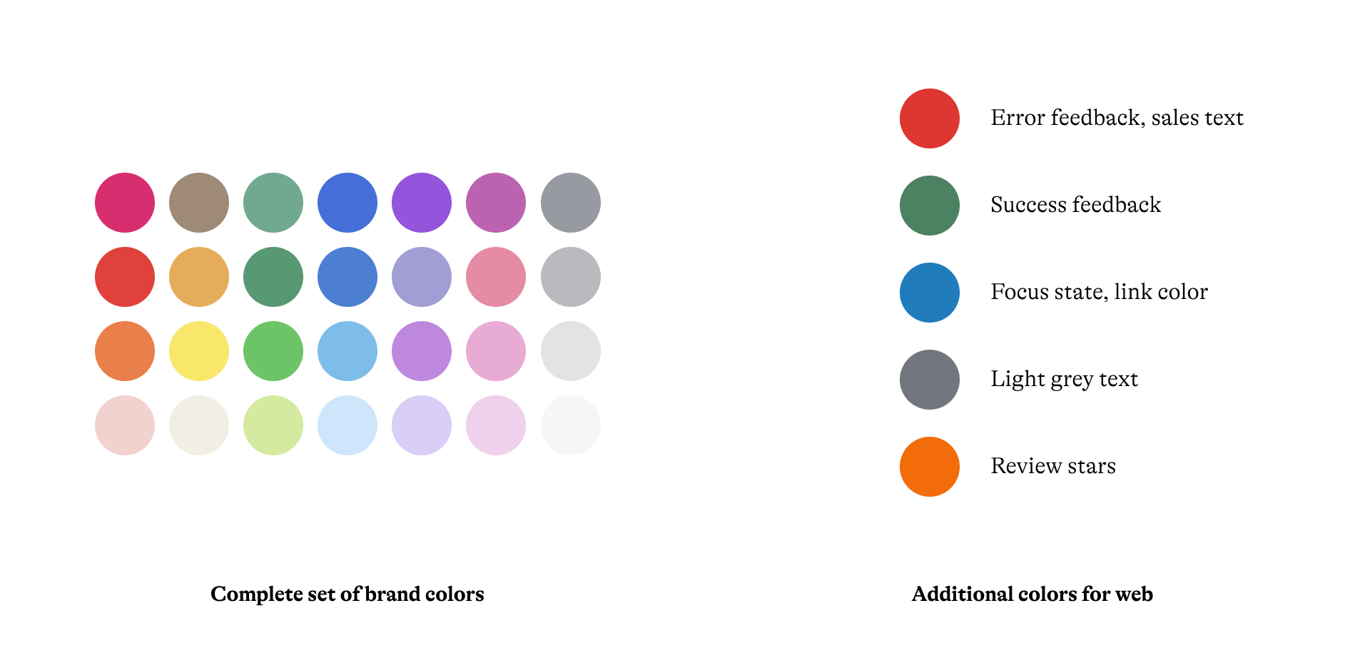
We added additional colors for web only that met our accessibility needs for text, icons, and UI elements.
Our new brand palette had 28 colors, and we worked with Collins to make sure that every one of those colors was at least a 4.5:1 contrast ratio against black text. We also needed some colors specifically for the web, like a blue for focus states and a yellow for review stars, that also met color contrast needs for UI. I came up with a few additional, accessible colors for these specific contexts that worked with the original set.
Use of color
Since color (and lots of it) was such an important part of the brand, we spent a lot of time talking about the right way to apply it on web. The print and social materials were covered in color, and it worked because in those contexts, designers had control over every page and graphic. But through our explorations, we realized there were too many pages on the site to ensure that colors wouldn’t clash as we used different modules in different situations across the site.
We kept the majority of the content on the product detail page, cart, navigation, and product list page black and white, letting the photos and the color swatches pop.
We added large washes of color in the footer, page headers, and navigation drawers.
We kept a lot of the task-oriented parts of the site pared back and in black and white, like the navigation, product detail page, and cart, while adding big splashes of color with the footer, page headers, and navigation drawers (more on this below). Color still felt special, but wasn’t used so rarely that it felt out of place whenever we used it. (Also: I wrote up a small story about the use of color on my blog.)
Design system
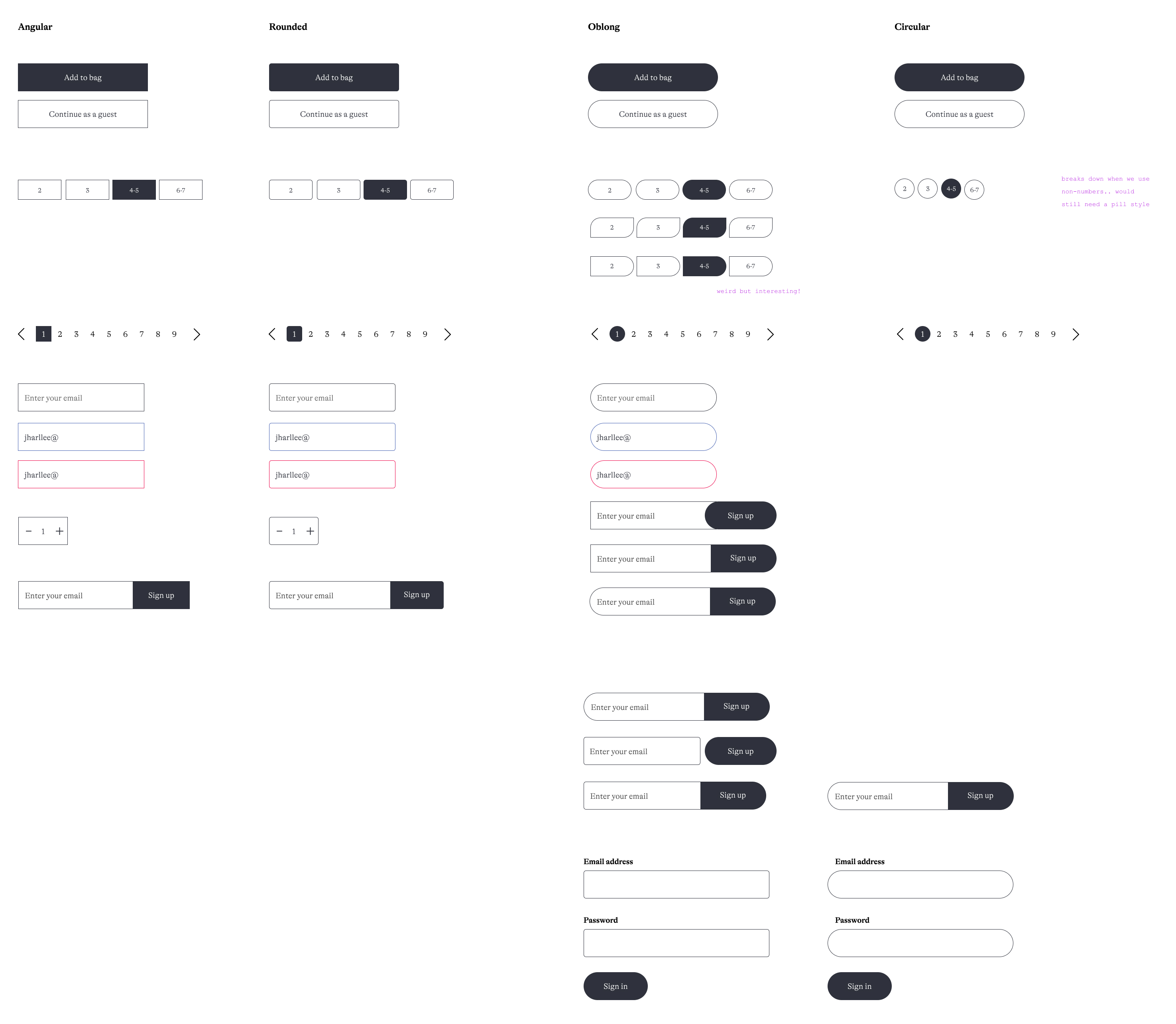
I visualized a bunch of different styles for UI elements like buttons and forms to have a conversation with the team about which styles fit the brand refresh the best.
As I iterated on the product detail page, product list page, and navigation, some stylistic patterns started to emerge. Seeing UI elements like buttons, inputs, and product cards in multiple contexts allowed us to start narrowing in on some visual design decisions. I explored angular elements with hard edges all the way to large rounded corners, and we ended up landing somewhere in the middle. There are a lot of right angles and grids in the layouts, but the illustrations (called characters) are organic shapes, and the brand typeface has very rounded terminals. We gave all of the UI elements 6px rounded corners for some softness and used oblong buttons. At this point I also started unifying the type scale. I set the body copy at 20px to make sure that the thin weight of GT Alpina was legible, then created sets of headline and accent sizes.
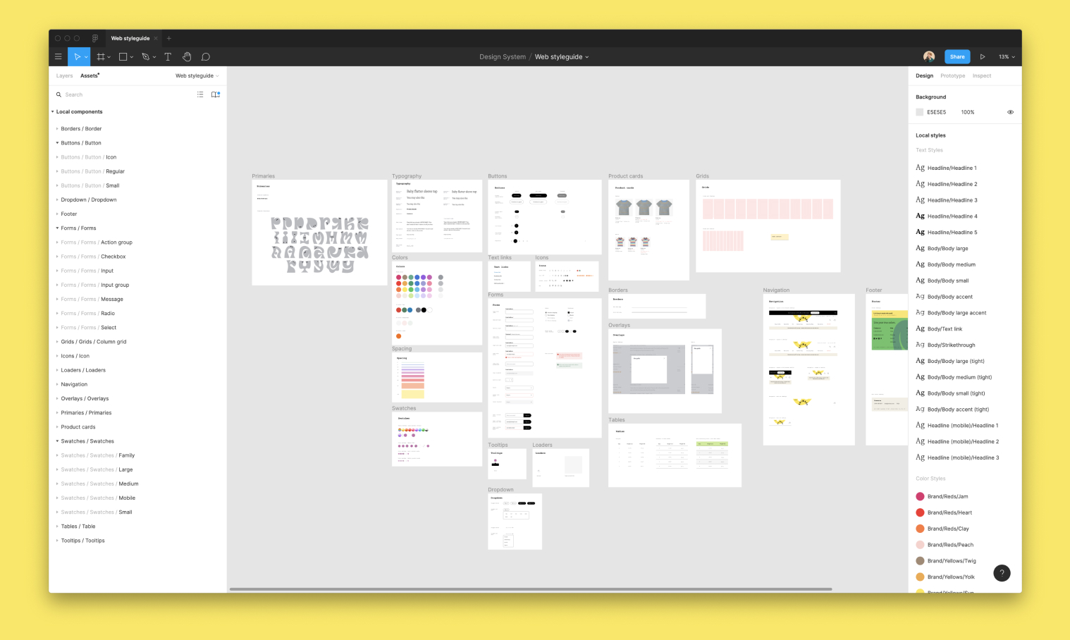
We used the rebrand as an opportunity to pilot using Figma, since the design systems tools are unmatched.
We had been using Sketch since I joined Primary, but the rebrand felt like a good time to give Figma a spin, especially since Figma is well-known for its design systems tooling. As I started making some of these initial decisions about type scale and UI elements, I created components and styles in a shared Figma library that we could update as our design system evolved. This made stress testing, tracking decisions, and iteration on the design system incredibly easy.
Designing the website
Once we had an initial system set up, we brought Yue, our associate product designer, in to help design the rest of the pages. She and I divided up the pages that still needed mockups and worked together to apply the rebrand to the rest of the site. As we progressed with our mockups, we shared them in design critiques, our 1:1s, and over Slack to make sure that we were applying it consistently and to talk about anything that was challenging or wasn’t working. We also continued to refine the design system as we used it across more pages, including adjusting the typographic scale, refining the breakpoints, and adjusting our secondary button style to have a transparent background.
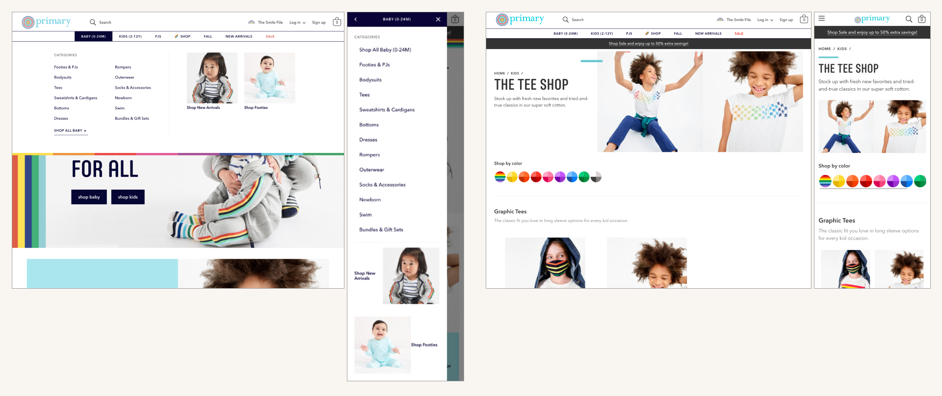
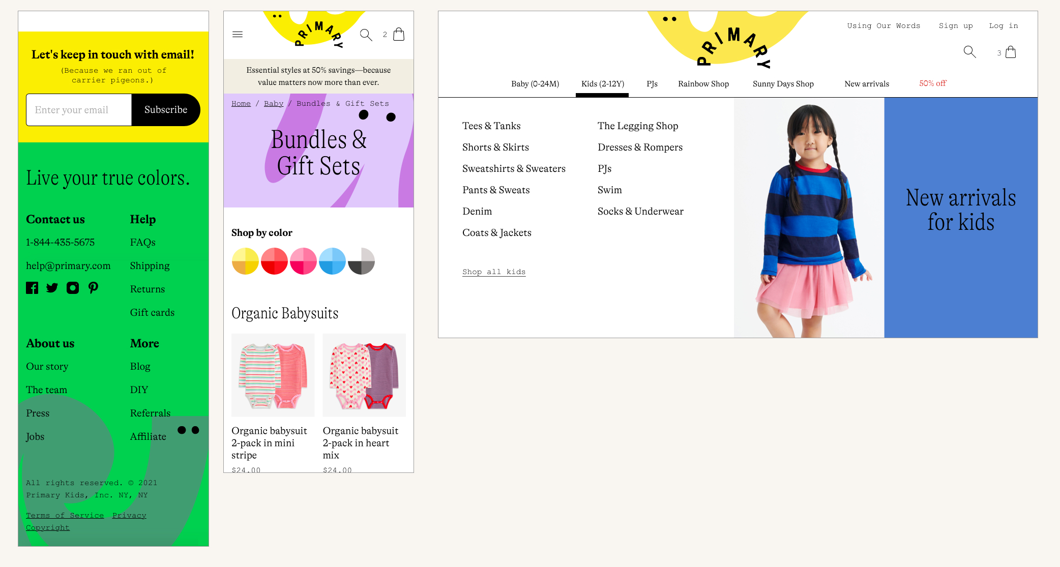
The navigation (left) and product list page (right) before the rebrand. The merch team refreshed the product list page headers and the images in the nav seasonally with new content.
One challenge I worked through was creating editorial spotlights on our product list pages and in the navigation that the merchandising team could update throughout the seasons with new products. On the current site, we were using lifestyle photography in the product list page headers and in the navigation drawer for our editorial spotlights, and we needed to figure out how to do something similar in the new brand. There was a layout style from Collins’ brand book that paired a photo with a wash of color and a headline in a 50/50 split, which seemed like a good fit for an editorial feature and an opportunity for us to boldly push color.
In order to fully pull off the photo + color editorials, we’d need a way to choose a color to pair with each photo we used. We decided to add a CMS for creating the editorials so our merchandising team would have full control over the pairings, allowing them to create dozens of unique editorials and really letting the rebrand shine.
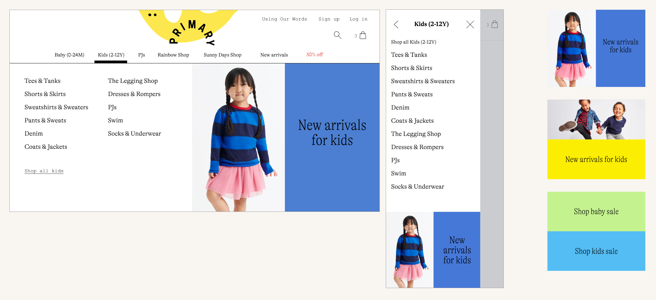
The rebranded navigation editorials and different layout options to choose from.
The rebranded product list page headers and different layout options to choose from.
I came up with a few different layouts for the product list page headers and the navigation editorials so it wouldn’t feel too predictable as you moved throughout the site and so we could be flexible depending on our photography assets. For the navigation, I created horizontal, vertical, and text-only options. And for the product list page headers, I added two other options in addition to the 50/50 layout: a text-only option, and a character background option. Everything was controllable through the CMS.
We built a CMS for product list page headers so our merchandising team could build their own by choosing between different layouts and brand colors.
I also explored how to bring animation into the website. As soon as our team saw the illustrated characters from Collins, we knew they needed to move. As we were talking about all of these different mockups in critique, we would get ideas for spots where we could add a small amount of animation as a fun, unexpected touch. Then, I used SVGs and CSS animation to prototype out in CodePen how these characters might move, blink, breathe, and bounce. I shared these prototypes in critique, with Collins, and with our art directors to refine what kind of motion made the most sense for the characters.
The desktop navigation logo hover state.
The footer character casually blinks, breathes, and looks around.
A character on the homepage, happily bouncing away.
Building the website
The Primary branding wasn’t the only thing in need of a refresh. While we were in the middle of refreshing the branding and design, the engineering team had been working on replatforming the entire site. The website had been powered by a custom CMS since Primary first launched, and the engineering team was sinking a ton of time into maintaining and fixing complex, custom functionality like checkout and admin tooling instead of working on functionality that aligned with our business differentiators. The site was riddled with tech debt from a slow move from Angular to React and an even slower move from Bootstrap and page-specific CSS to more modular CSS. In short, the platform was extremely difficult to work on. The rebrand presented the engineering team with the perfect opportunity to start over completely, and we decided to launch the rebrand on a brand new platform.
When we began the replatform work, we knew that the rebranding was coming but we didn’t know what it was going to look like. This was going to make the few months between when we started the replatform and when we had a fully fleshed out design system interesting; how could we build a site when we don’t know what it should look like?
After a bit of investigation, it became clear that there wasn’t very much salvageable CSS from the current site. A lot of the CSS had been written in a very page-specific way, and the pieces that were meant to be reusable weren’t very modular. It seemed like it’d be faster to start from scratch on a new CSS system than to take bits and pieces from the existing one. Plus, it was possible that the rebrand would look radically different, in which case we wouldn’t gain too much from preserving the existing CSS.
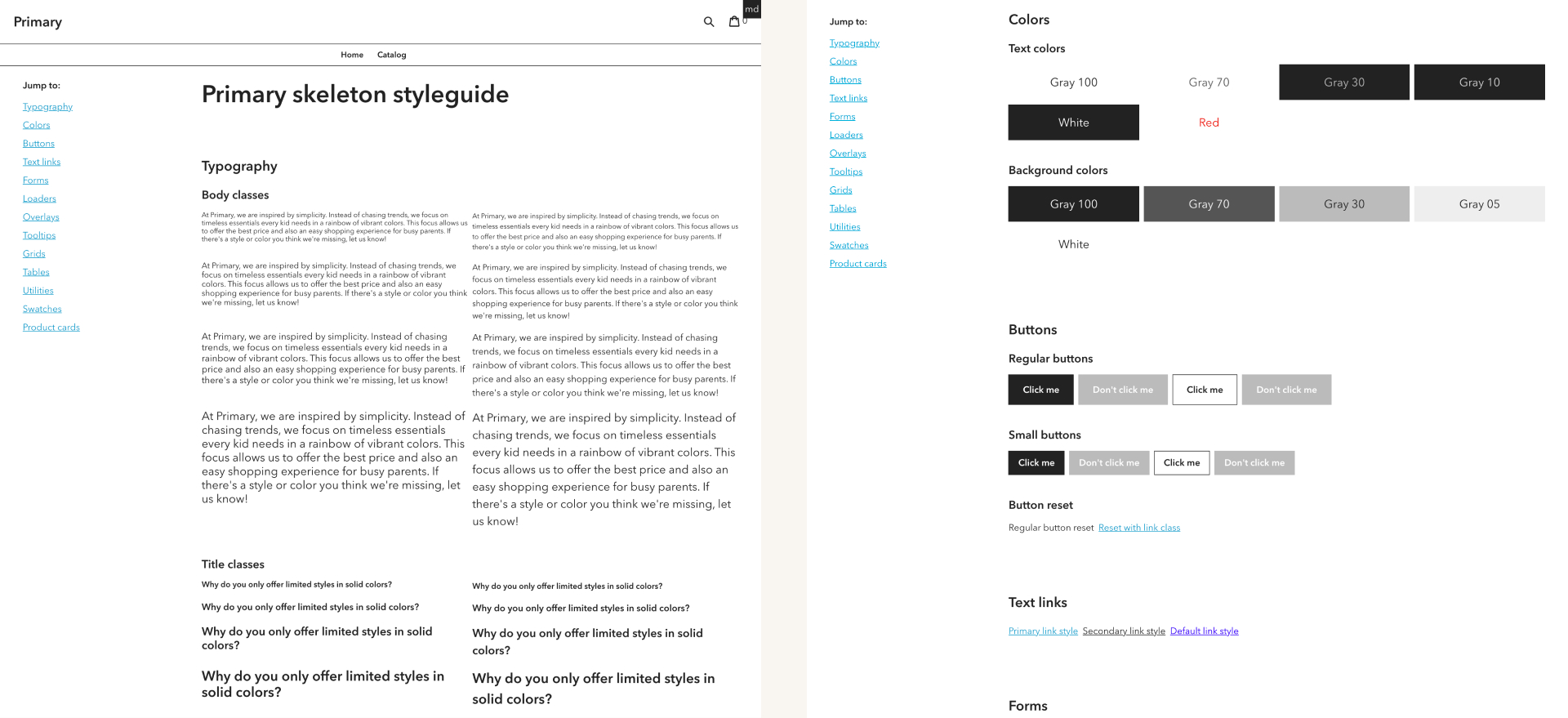
The bare bones CSS framework I wrote, with the goal of unblocking engineering and later swapping in brand refresh styles.
I went to work on writing an “unbranded”, basic styleguide structure that I called the “skeleton” styleguide. It was a totally stripped down, bare bones CSS framework. Even though there were a lot of unknowns at the time (like what it was going to look like), there were still a lot of knowns. We were going to need a grid system. We’d need utility classes. And we’d need basic interface elements like buttons and overlays with different states. I tried to make it as updateable as possible by only styling the elements with black and white, using a single placeholder font, and using variables for nearly every CSS value. This gave us a framework with which we could build out page templates, unblocked the engineering team, and bought me some time to figure out what the site was going to look like.
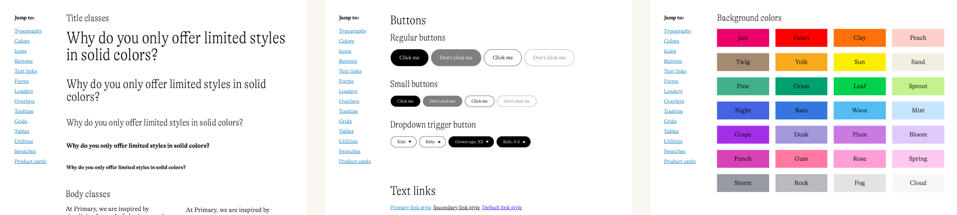
Examples from the reskinned, no-longer-skeletal styleguide.
A few months later, when we felt good about the new design system, I got to work on updating the new version of the site to match the rebrand, first by updating each component in the styleguide, then by doing a sweep page-by-page to tweak things like type and spacing. We quickly went from having an unbranded version of the site to one that was nearly indistinguishable from the mockups.
Our original goal was to launch the rebrand and the replatform simultaneously. Launching the rebrand meant committing to an unmovable deadline, since we had to plan months in advance for the clothing labels, packaging, catalogs, and packing slips to all be updated with the new brand. As we got closer to the launch date, we realized the replatform would not be ready in time, and we made a quick pivot to reskinning the existing site for the rebrand launch and paused the replatform in the meantime.
I worked with the tech leads to evaluate different technical options for updating the design of the current site in six weeks. We listed out different ways we might completely transform the look and feel, from overriding the CSS, to updating the existing CSS to match the rebrand, to using the new CSS that we had written for the replatform. Since the CSS on the current site wasn’t centralized to begin with, and I had seen how quickly we could use our new classes to build brand refreshed pages, it seemed like our best option was loading the new CSS and then updating the markup to use all of the new CSS classes. The tech leads did a quick proof of concept, and then we kicked off the engineering team on brand refreshing the existing site. Meanwhile, we made a list of pages that hadn’t been rebranded, since some features would have been handled by the new platform, and Yue and I quickly designed the unaccounted for pages.
Six weeks later, we had fully transformed the site.
The final design
The final product detail page design that we launched. Note that the product image sticks alongside the product description on the website.
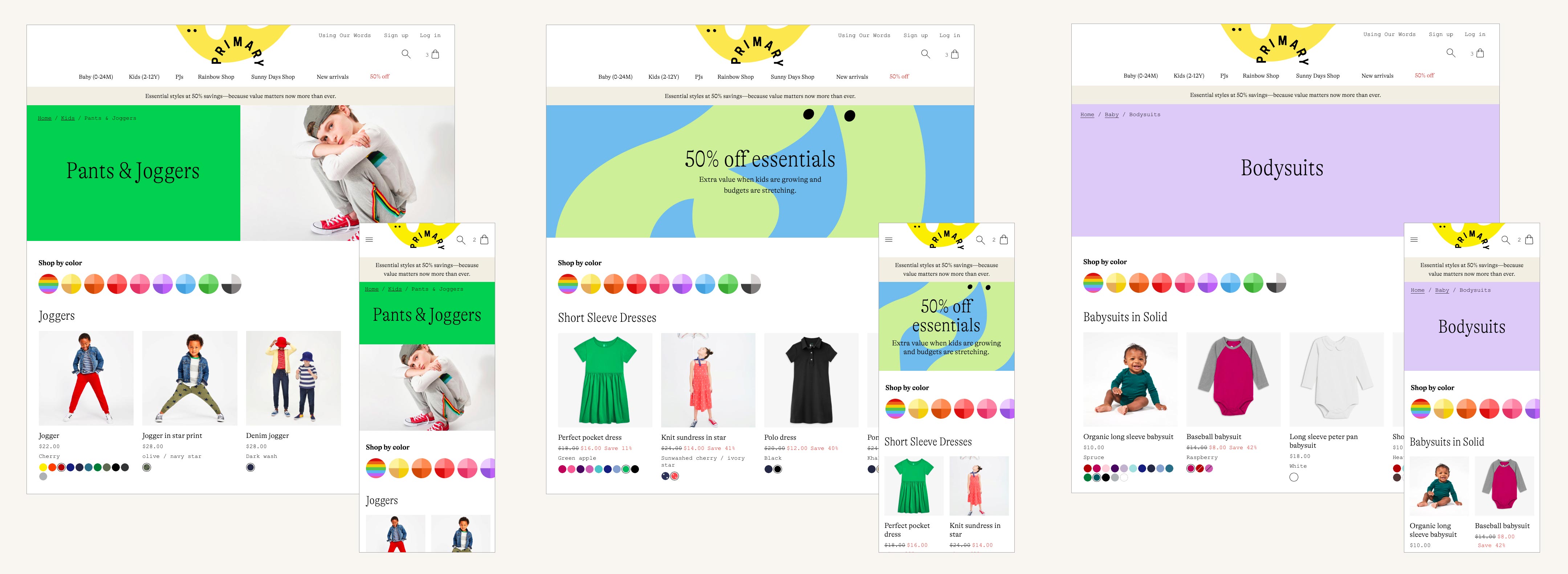
The final product list page design that we launched.
The final homepage design that we launched (more on the homepage to come).
Launch and reception
In early September 2020, we launched the brand refresh across every channel, an effort that involved every team at the company. Overall, customers loved it and the rebrand was extremely well-received. One thing that was especially clear was that we were doing a better job telling our story; we received a ton of comments on social media about how much people loved our mission.
While running an experiment was out of the question, we monitored key metrics to make sure everything largely stayed as expected.
Project details
Role
Lead designer (on web), front-end development
Core team
2 designers (me, Yue Zhang), 6 engineers, 1 CXO (Cap Watkins)
Creative team: 2 art directors (Gerard Zengal, June Bae), 1 part-time creative director (Deva Pardue)
Partners
Collins (Creative Director: Thomas Wilder, Senior Designer: Jump Jirakaweekul)
Released
September 2020