In 2023, Faire’s CRM pod spent two quarters refreshing and improving our customer segmentation tools for brands selling on Faire. I put together a lo-fi design vision outlining the desired end state for the improvements we wanted to make, then worked with the PM and EM to break that vision apart into a series of projects we could ship one-by-one. Through customer research and working closely with our customer-facing teams (such as customer support), we shipped an improved segmentation experience that simplified workflows, addressed design and tech debt, and moved business metrics.
Jump to:
- Historical context
- Zeroing in on segmentation
- Current state audit
- Creating a six-month vision and plan
- Project 1: Replacing the segment tabs
- Project 2: Overhauling the filters UI
- Project 3: Simplifying the segmentation management UI
- Project 4: Customer detail refresh
- Project 5: Introducing order history filters
- Project 6: Introducing custom tags
- Finals
- Reflections
Historical context
Faire is a two-sided wholesale marketplace where retailers (such as brick and mortar stores) can purchase items from brands at wholesale prices to sell in their stores. Relationships are a huge part of wholesale, and so Faire had built its own very basic suite of CRM tools, including a customer database and email marketing tools, back in 2019 that allowed brands to build and maintain relationships with their customers (retailers).
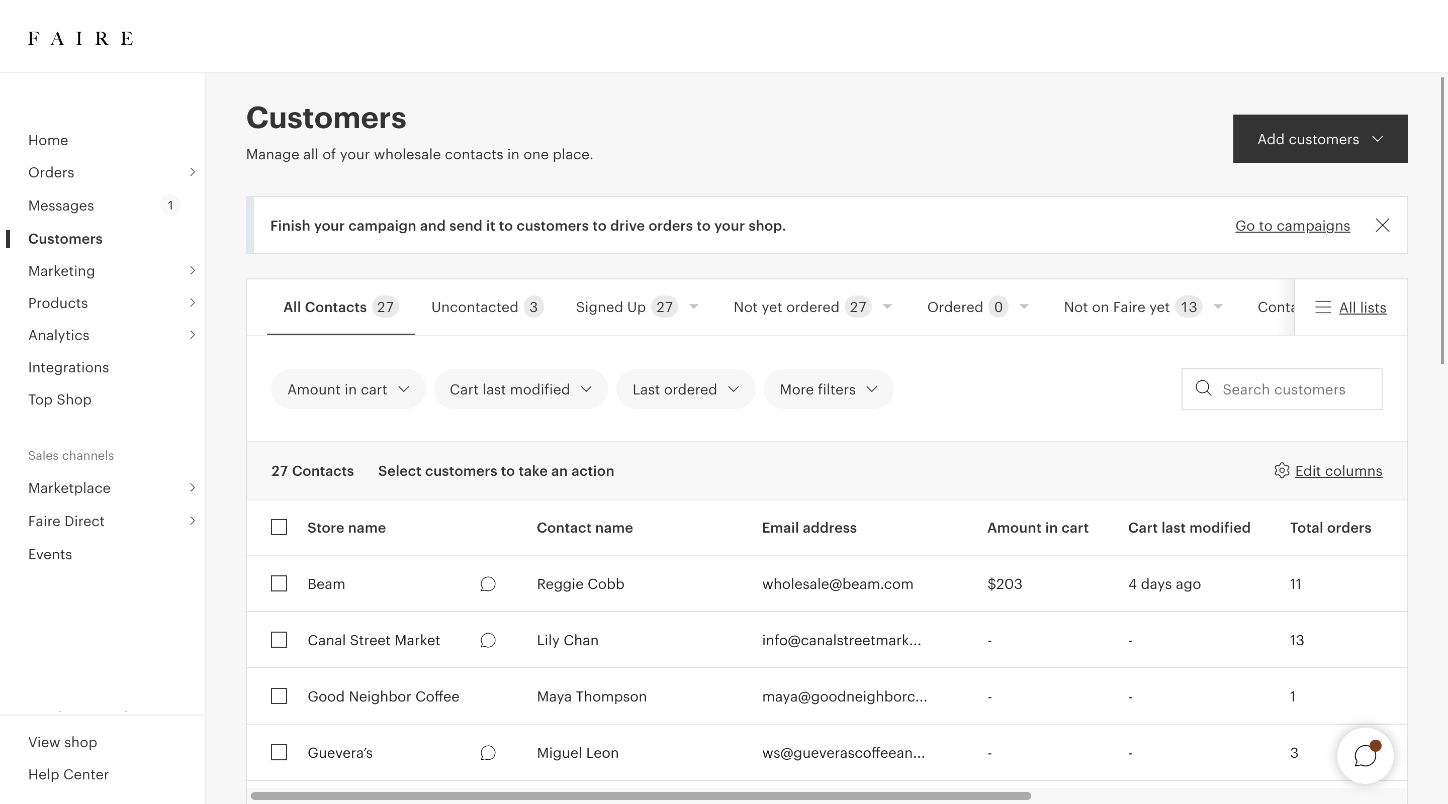
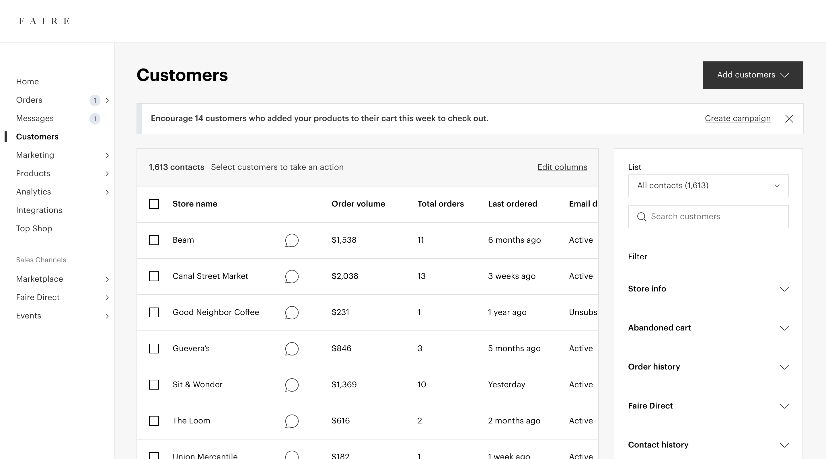
Faire's Customers tool, a part of the brand CRM, at the start of this body of work.
The CRM tools had originally been built primarily for brands to prospect and for Faire to acquire retailers onto the platform, but hadn’t been invested in very much until my team, the CRM team, was spun up in 2022. As the PM and I dug deeper into the CRM space by interviewing brands, reviewing data, and launching features, we realized that the way that brands were using our tools, and the way that they wanted to use our tools, was for nurturing existing relationships and driving reorders. And Faire hadn’t been optimizing the CRM tools for this use case.
Zeroing in on segmentation
Heading into 2023 planning, the PM and I wrote a strategy doc that outlined our plan to focus on helping brands with customer retention and building relationships. Once the strategy was approved by leadership, I co-led a cross-functional design sprint with our content designer and prepared a vision deck that outlined where we wanted the CRM tools to end up in the next 12-18 months through our new focus on nurturing existing relationships.
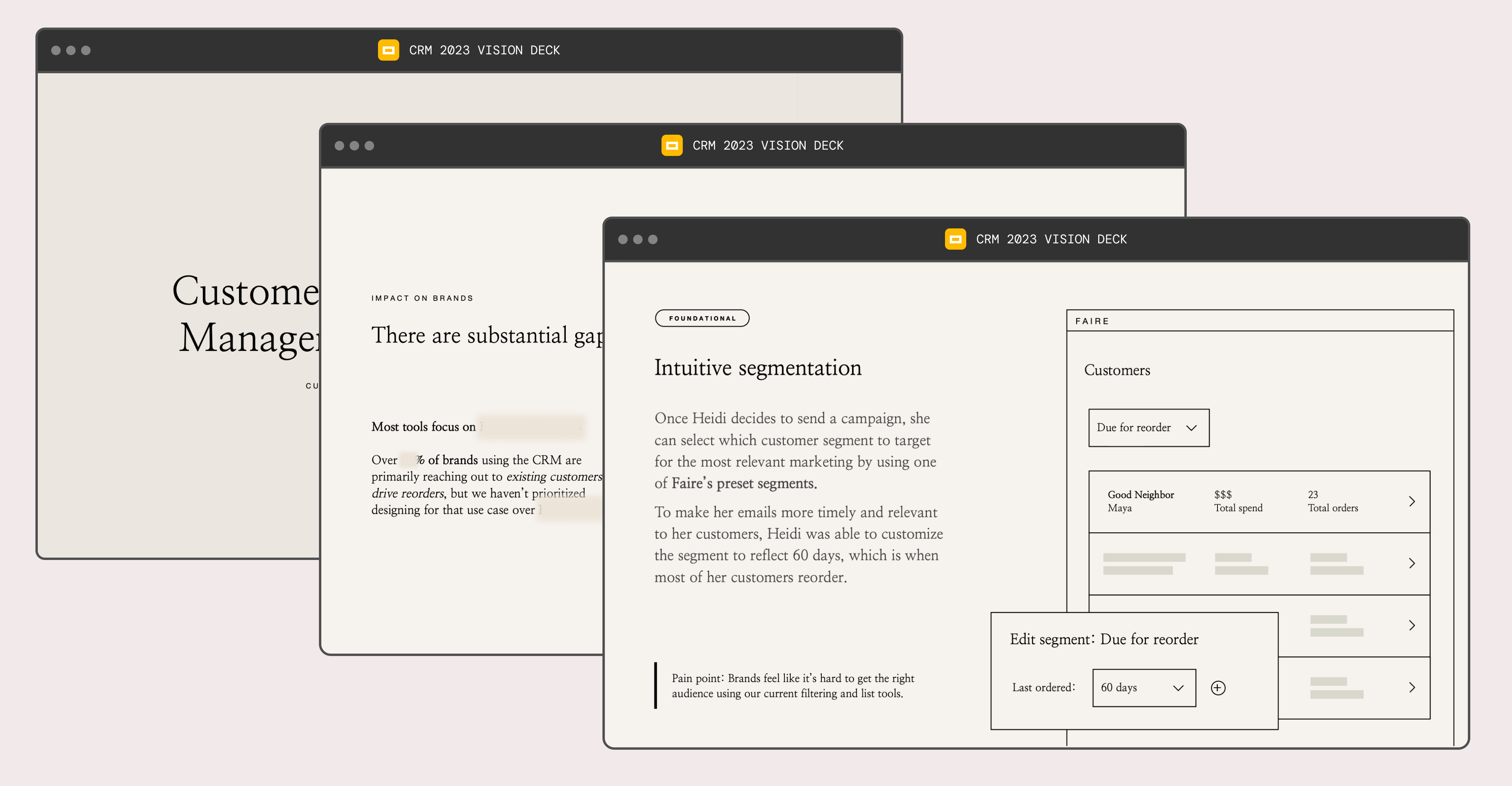
Slides from the 2023 vision deck, which outlined our team's strategy and opportunities.
A lot of really great longer-term ideas came out of the design sprint and the vision deck, and it became clear to us that in order to make those ideas successful, we’d need to heavily invest in improving our customer segmentation tools.
Faire had existing segmentation tools but they were complicated to use and difficult to discover and therefore rarely used by brands. The success of a brand’s outreach was dependent upon the right audience receiving the right message, and so we decided to focus on segmentation tooling first. We saw an opportunity to simplify our segmentation tools, fill in some missing feature gaps that were critical to reaching out to existing customers, and address some longstanding design and technical debt while we were at it.
Current state audit
The first thing I did was a thorough audit of the current state of segmentation, including compiling existing data, research, and insights from our customer-facing teams.

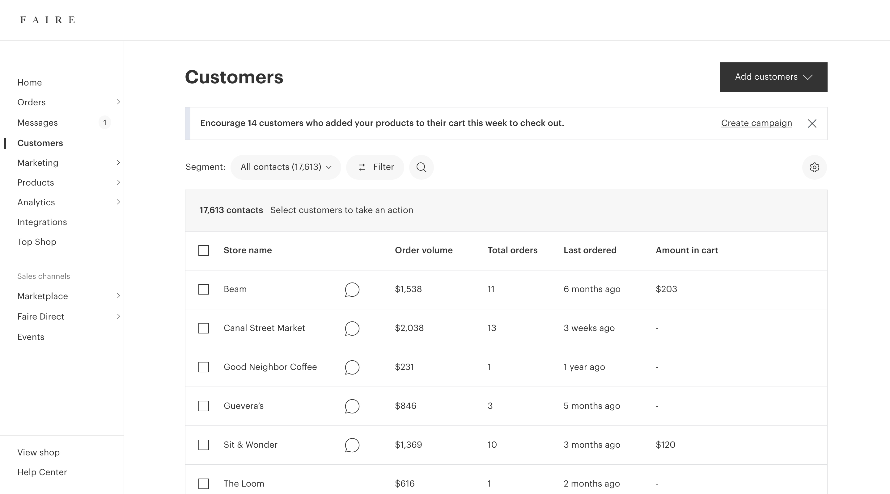
The Customers tool at the start of this project, with lists accessible via the tabs at the top of the table.
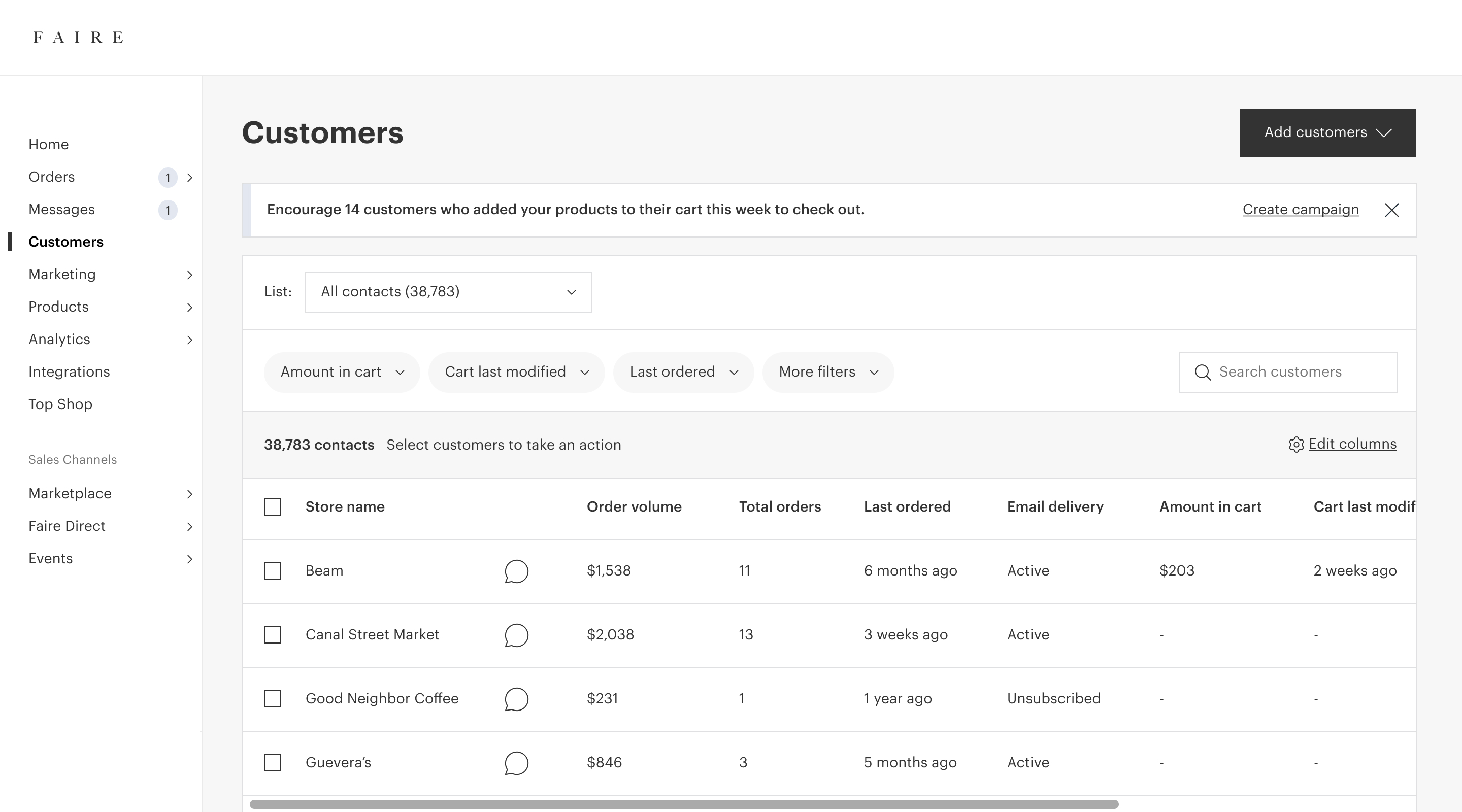
Faire’s segmentation tools were called Lists and managed in the Customers tool. A brand’s lists were accessible by clicking on the tabs across the top of the table. Faire started brands off with a few default segments (shown above) when they created their account, but they were related to niche Faire workflows so most brands didn’t think they were useful.
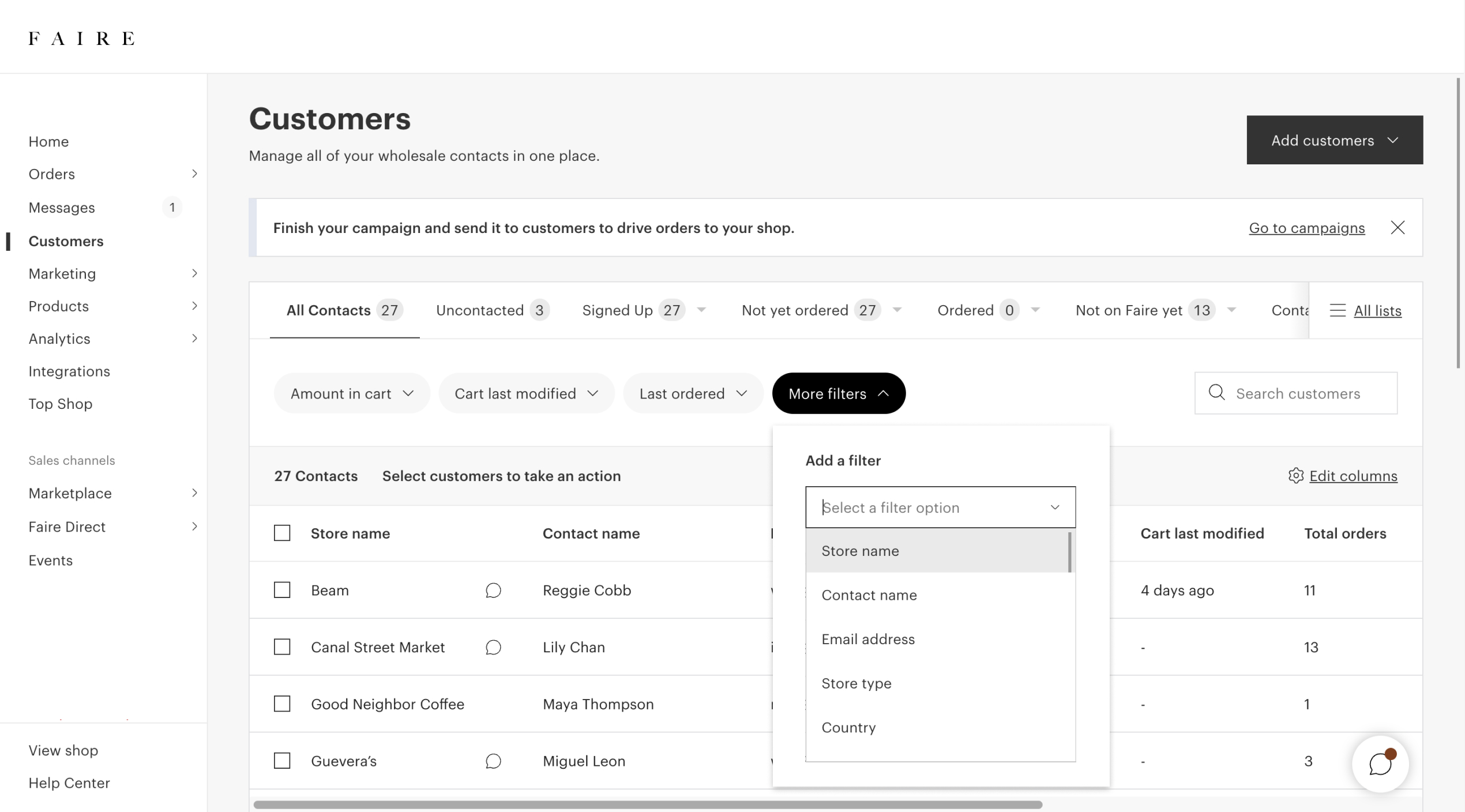
The filters dropdown, containing over 30 filters to choose from. Not many brands filtered, and even fewer saved them as a list.
The first step to segmenting was using filters. Brands often had hundreds or even thousands of customers, but most brands did not use filters. One brand told us that she opened up the filters dropdown (which contained over 30 filters), got overwhelmed, and never tried filtering again. Brands also thought there were key filters missing, like which items a customer had purchased.
"All of this stuff on the screen makes my brain tired."– A brand in research
Once a brand applied filters, they could save those filters as a list. Very few brands had ever created a list themselves, though. From speaking with brands, we had heard that they wanted to segment and knew that they should, but found the process on Faire confusing and overwhelming. We saw in research that brands were struggling to figure out how to create lists; we even heard one brand say that all of the stuff on the screen “made [their] brain tired”. And our account managers, who worked directly with brands, told us that they spent a lot of their valuable time teaching brands how to create new lists.
There was also a dedicated list creation flow where brands were taken through the process of creating a list step-by-step. But, that flow was extremely buggy and poorly maintained because we were recreating the customers table in a separate flow.
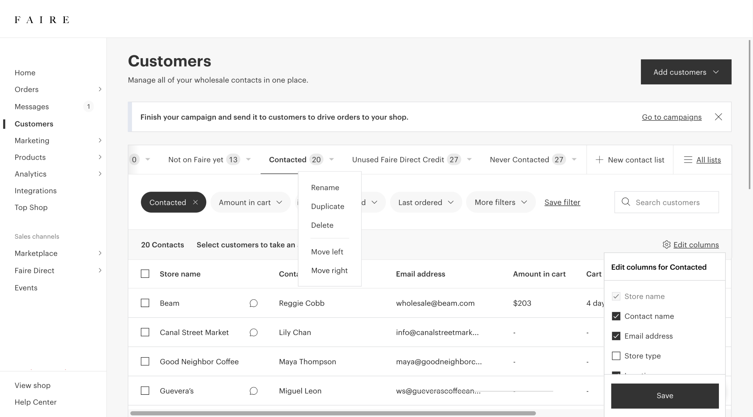
Actions brands could take on lists.
Brands could also perform actions on lists: they could delete, rearrange, rename lists, they could update the filters constructing the lists, and they could edit which table columns were visible.
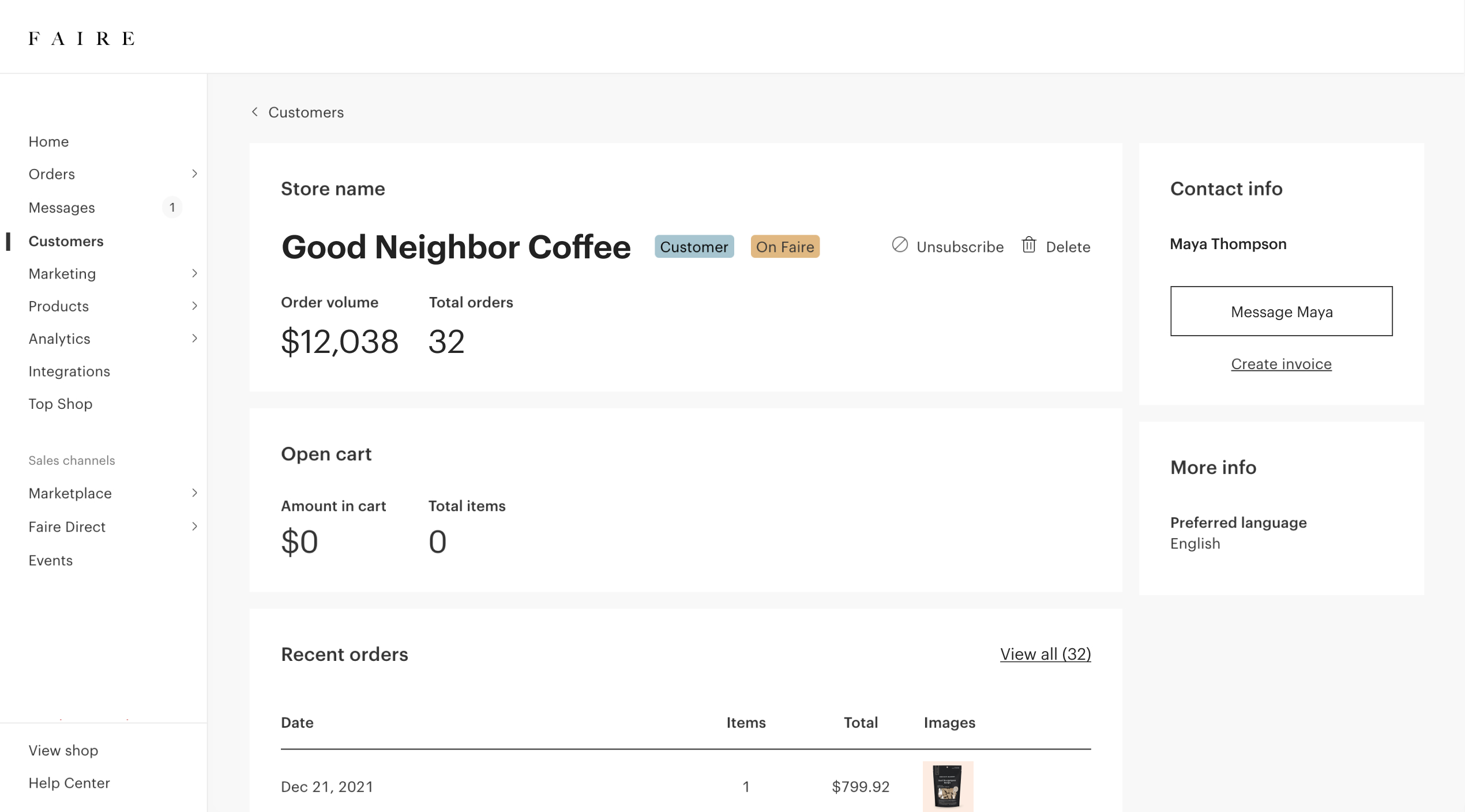
The customer detail page at the start of this project.
Finally, a brand could click on a customer to view the customer detail, but it was missing a ton of information. Brands also couldn’t layer in their own data, leaving them at the mercy of whatever data Faire had.
Creating a six-month vision and plan
Coming out of the audit, I felt strongly that simplifying the workflows and decluttering the UI would help brands segment more successfully. But because there were so many touchpoints for segmentation, I felt like we couldn’t just dive in and iterate as we went without first thinking holistically. I spent 2 weeks putting together a segmentation design vision that included a mix of new and existing features, a different architecture, and a different approach to the UI. Since this was just dedicated time for explorations and high-level thinking, I focused on broad workflows and kept the fidelity at low-to-mid fi to make sure that we were getting feedback from leads on flows and functionality.
Example screens from the lo-fi vision prototypes.
Some of the hypotheses I explored included:
- Using different design elements, like a dropdown for selecting segments and a button for exposing filters, would simplify the UI of the customers tool and save a lot of vertical space.
- Using a side panel for filters would allow for more exploration and organization of the filters.
- Moving segmentation creation and management into its own surface would declutter the customers tool and eliminate the need for having two paths to creating segments.
- New features like multiselecting filter options and filtering by products purchased would make segments more useful to brands and more powerful.
Brands responded positively to the prototypes in research, and thought the updates were more straightforward than the existing workflows. Some brands weren’t totally sure if a separate area for segments made sense. We heard from some brands that they liked exploring the filters and then creating a segment, rather than using the “add segment” flow. But overall we felt good about the direction we were heading in and felt that we could dig deeper into the feedback in future iterations, so we moved forward.
Then, I worked with the PM and EM to take those prototypes and break them down into a roadmap of smaller projects that we could release one-by-one.
Project 1: Replacing the segment tabs
In our first experiment, brands used the dropdown to navigate their segments, rather than tabs.
The first project we sequenced was a quick UI change to replace the segment tabs with a dropdown to simplify all of the actions on the screen and create some space for us to refine the UI. We put this together in a matter of days, ran it as a “do no harm” experiment, and shipped it to all brands.
Project 2: Overhauling the filters UI
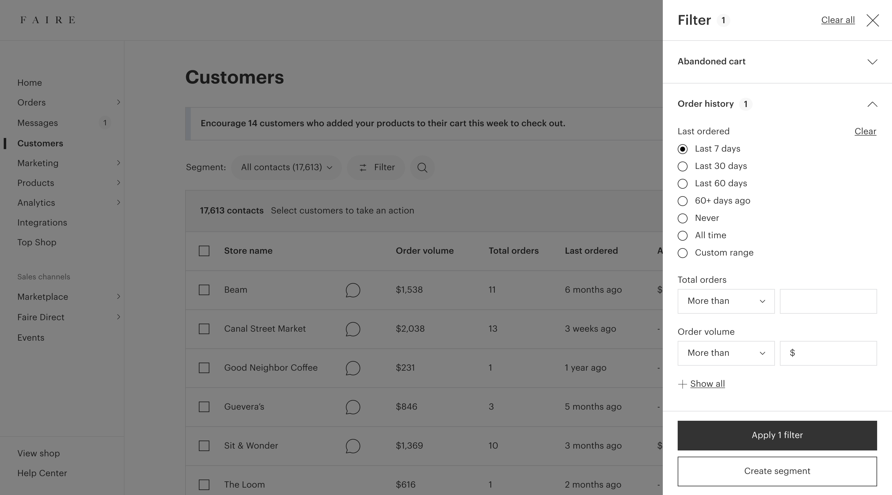
The next project we sequenced was a refresh of the filters UI. None of the other tools for brands on Faire had close to as many filters as we did (over 30!), so we were setting the tone for how to scale a filters experience.
We usability tested two layouts with brands to understand how brands wanted to discover and engage with filters while exploring their customers. The first option was the side panel from the vision prototypes, and the second option placed all of the filters in a sidebar directly on the page. I also explored using accordions to group filters and create some focus.
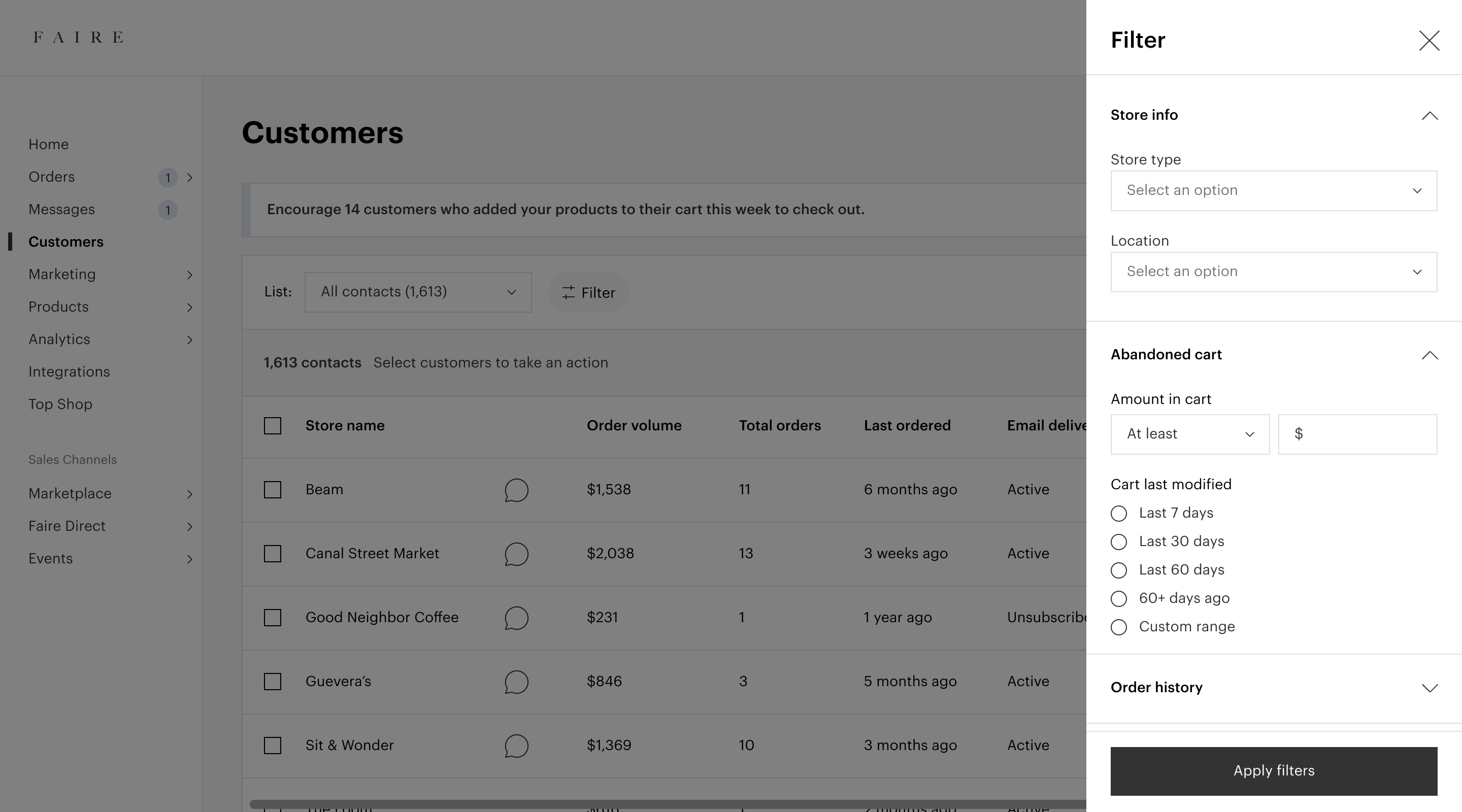
Filters option 1: Clicking on the Filter button revealed a side panel containing all of the filters.
Filters option 2: All of the filter options shown in a sidebar directly on the page.
Overall, brands told us that having all of the filter options directly on the page might make them more inclined to click on the filters. However, they thought that the side panel created a more guided and focused experience, which was exactly what we were aiming for. So we moved forward with the side panel.
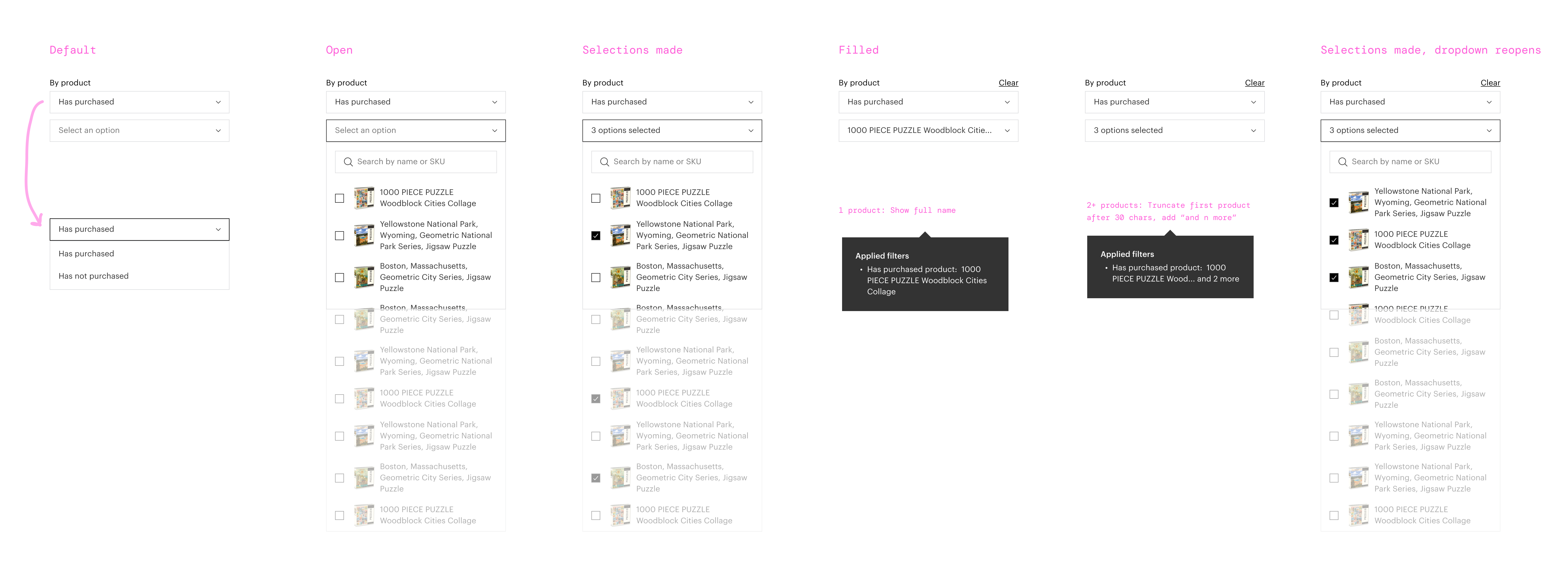
Next, I worked with content design on the grouping, naming, and prioritization of the filters and filter groups. I fleshed out all of the states and patterns for each type of filter, including some of the new features like multiselect. Finally, I worked with our design systems team to add the side panel and accordions to our component library, since these patterns did not exist and there were other teams that wanted to use them.
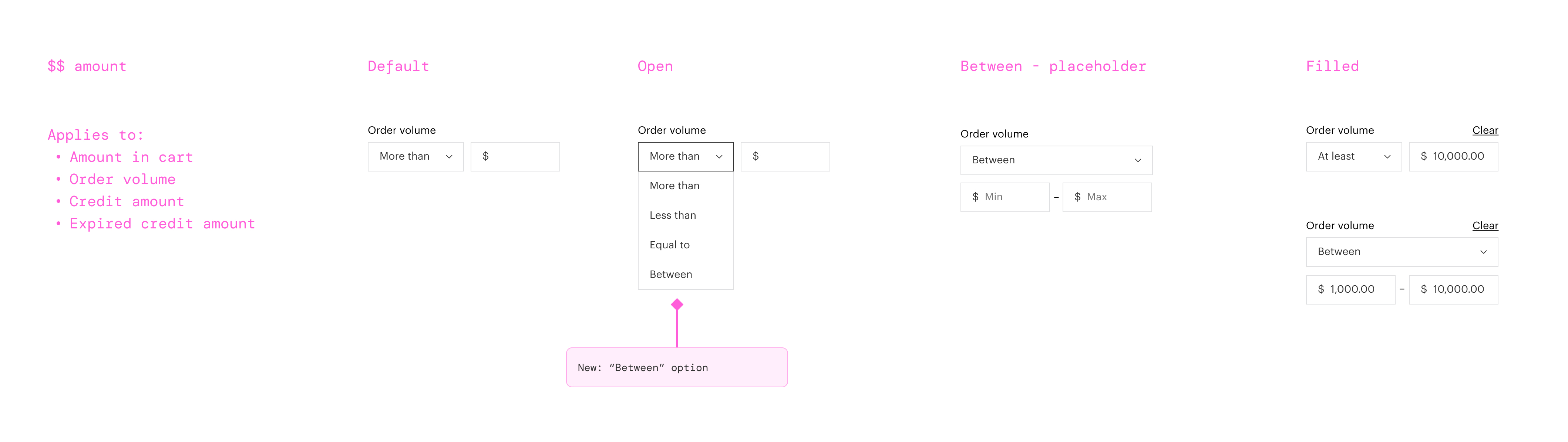
Example of the states for one of the filter types.
We launched this as an experiment and saw mixed results with some of our secondary metrics. However, we were seeing increased segments usage and positive downstream impact, including on our North Star metric. This felt like a clear indicator that improving the UI and simplifying would lead to more segmentation overall, so we launched it to all brands.
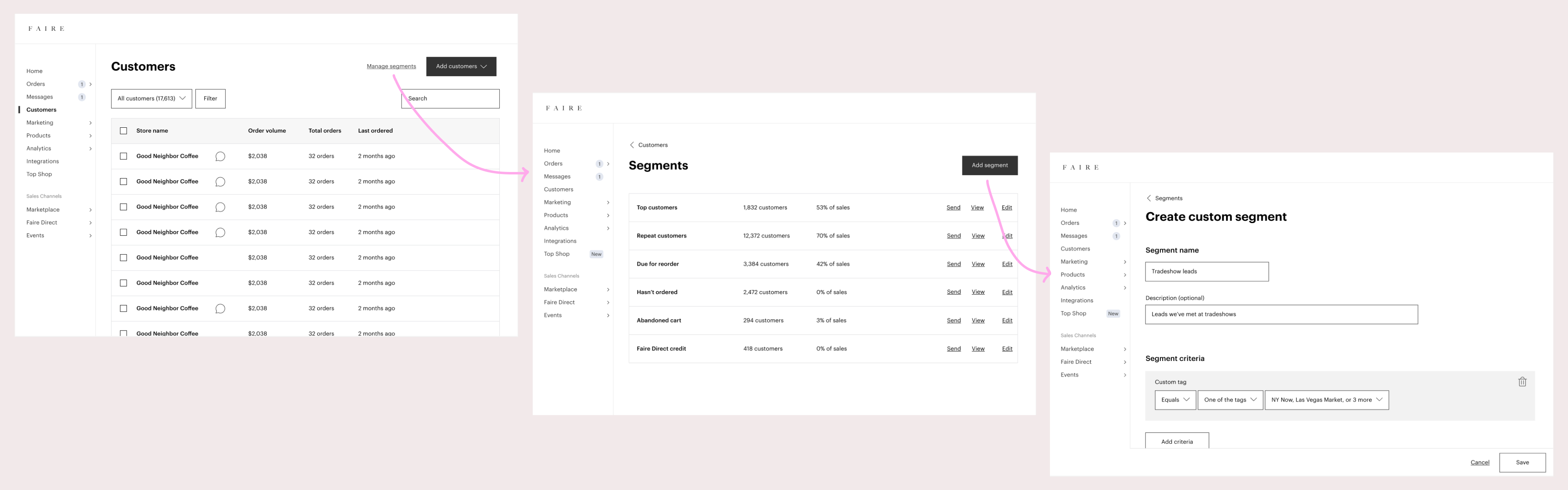
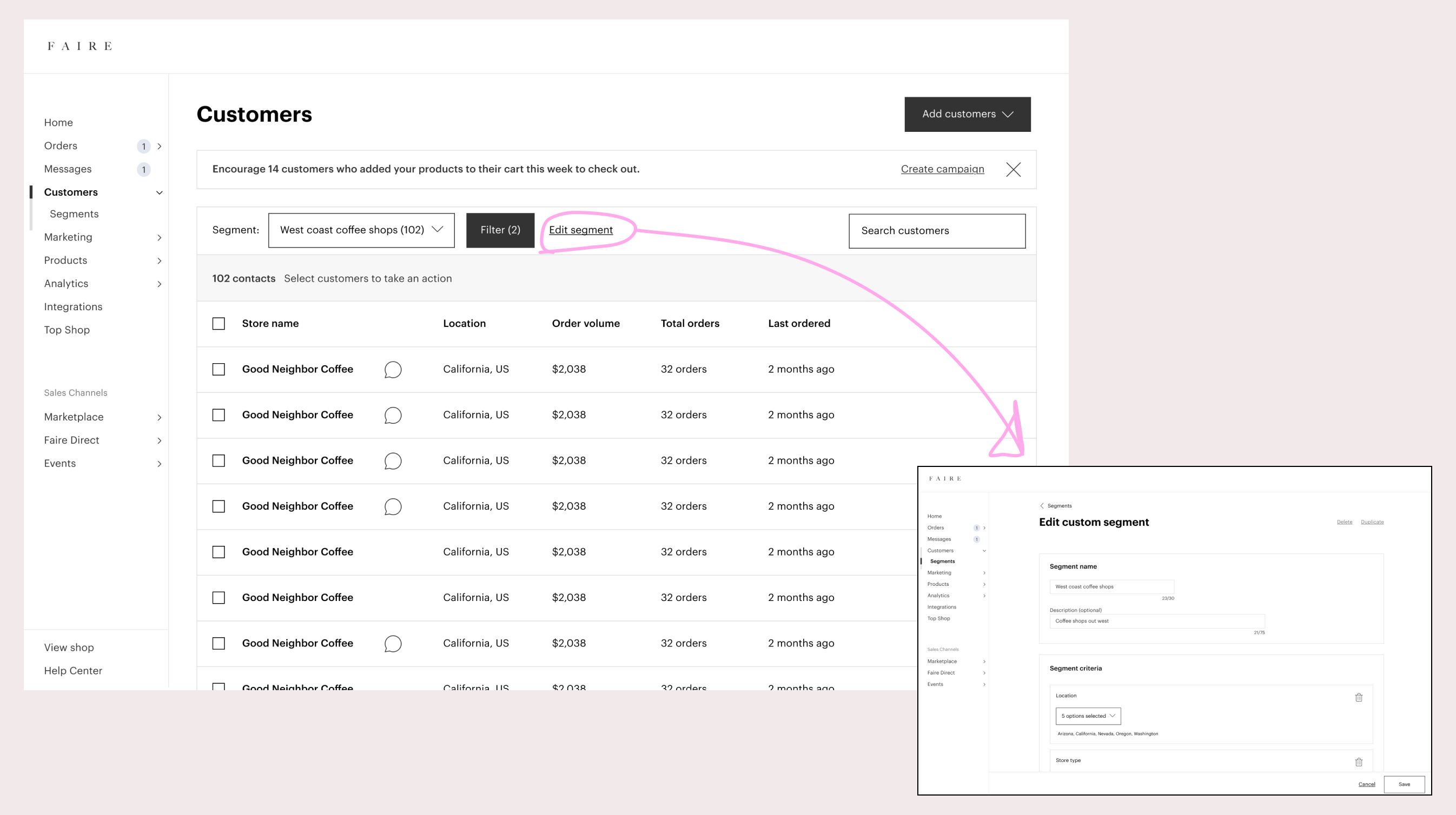
Project 3: Simplifying the segmentation management UI
The next piece of work focused on the UI for managing segments, including creating and editing segments. My original hypothesis from the vision prototypes was that a dedicated home for segments would simplify the UI of the customers table, so I started from those initial mockups and went a layer deeper, exploring a segments landing page, entry points from the customers tool, and the flow for editing and adding segments.
Should a brand be able to edit a segment's table columns without going to the edit page?
Everything had been going smoothly except for one of my stress tests. Say a brand is viewing a segment on the customers table and wants to send a campaign to those customers. If they wanted to double-check some information about those customers before sending the campaign, but those table columns aren’t visible, should the brand be able to edit the columns from here? Or should they have to go back to the edit flow to make any changes to the segment?
Should a brand be able to save filters as a segment without going to the create a segment page?
Similarly, say a brand is viewing the customers table, applies filters, and then decides that they want to save those filters as a segment. Should they be able to create a segment from here? Or would we force them to recreate this set of filters in the create segment flow? Brands had told us in our research sessions that they often liked exploring filters before creating a segment.
As I started trying to add functionality back into the customers table, it felt like I was just creating two similar but separate experiences for managing segments, which was the exact problem that we were having today. After bringing this to design critique, I decided to go in the opposite direction with my explorations.
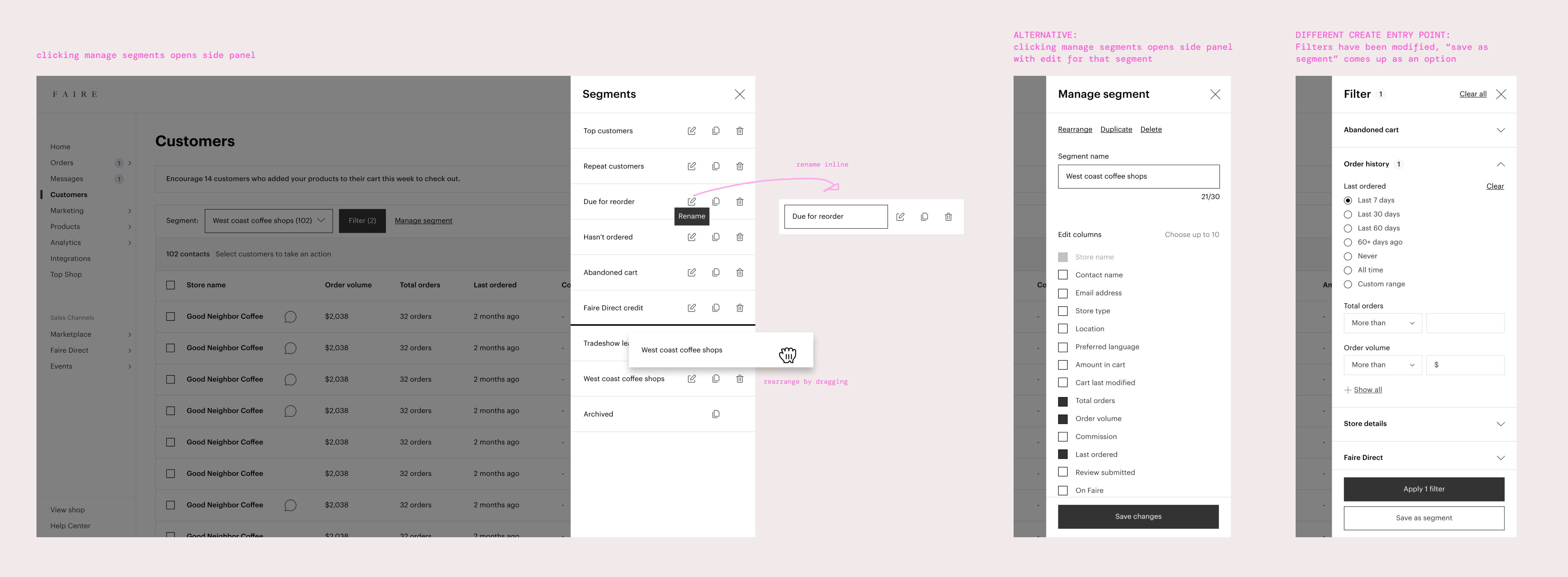
Explorations that kept brands on the customers table while managing segments.
I tried a few ways to keep brands on the customers table to manage segments. I explored using a side panel for viewing and managing all segments, a side panel as an edit screen for a single segment, and adding the CTA for saving a segment into the filter panel. A side panel seemed like a natural spot for editing which table columns were visible, versus the small dropdown that we had before. However, the side panel was too much screen real estate for the actions you could take on segments (renaming, duplicating, deleting), since those actions didn’t need much UI besides a confirmation button.
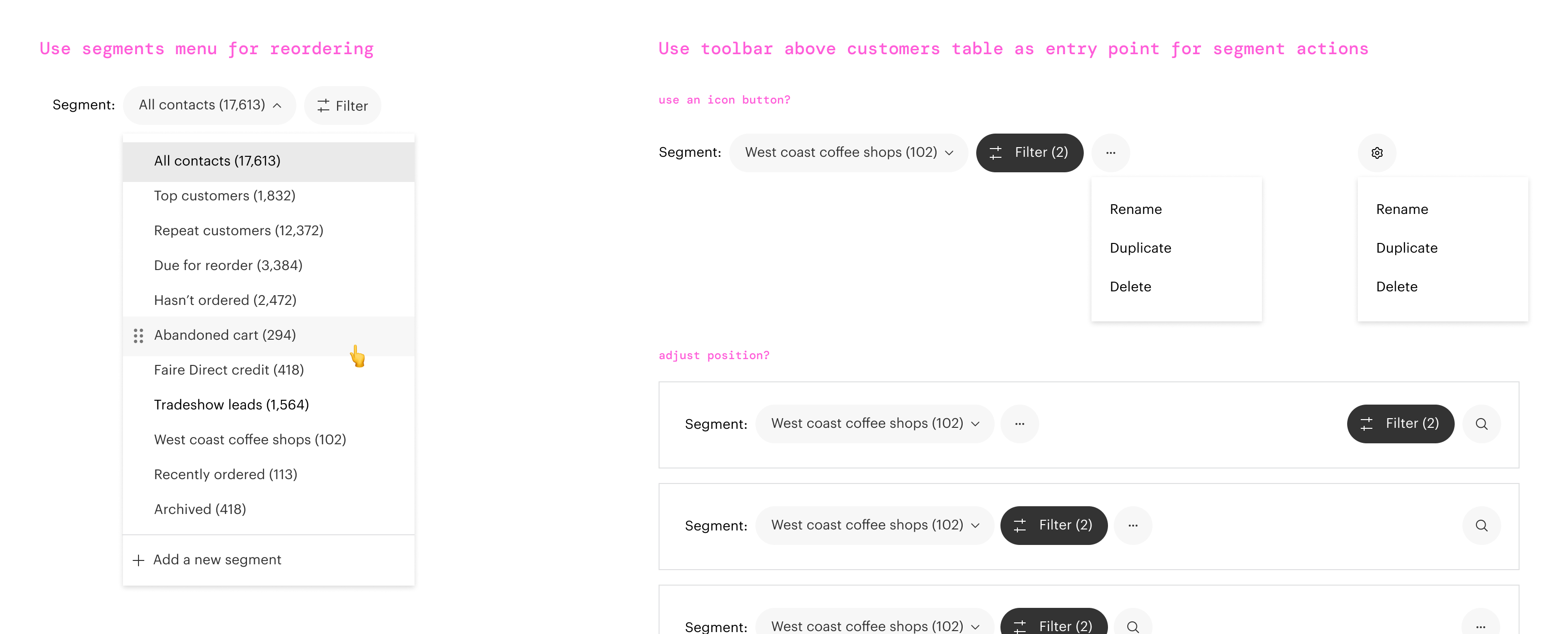
Explorations for entry points into segment actions.
Continuing my quest to simplify, I decided the actions on segments could be deprioritized and placed in a settings menu, since they weren’t used too frequently. We could integrate the UI for rearranging segments into the dropdown menu. And we could clean up the disparate styles in the toolbar area above the customers table so they felt more cohesive. I worked with the Brand Design Systems rep to incorporate the latest styles for the brand portal, including switching the background color to white, and we aligned on a toolbar style that would work across all of our brand tools.
To gain confidence in our approach, the PM and I set up feedback sessions with customer support and account managers, since they were so frequently helping brands create and manage segments. The feedback was positive, especially around how much the workflow had simplified. Finally, we worked with those teams to outline new default segments that we wanted to create, like an abandoned cart segment, and default segments that we wanted to deprecate as part of the launch.
We released these updates as an experiment and saw that our key metrics were up, including our North Star metric, and we were able to recover the dip that we had seen from the filters experiment.
Project 4: Customer detail refresh
Next we tackled the customer detail. The goal was to do a quick design cleanup to get it on our design system and to fill in all of the missing information. Since we were treating this as cleanup and we weren’t expecting this to have a business impact, we didn’t plan an experiment.
I started with the architecture of the page, audited what was missing, and grouped the info into clear sections that adjusted order based on priority. Then I ironed out different states and situations for each of the modules. We also updated it to use the white background, the common brand tools header, and refreshed the typography.
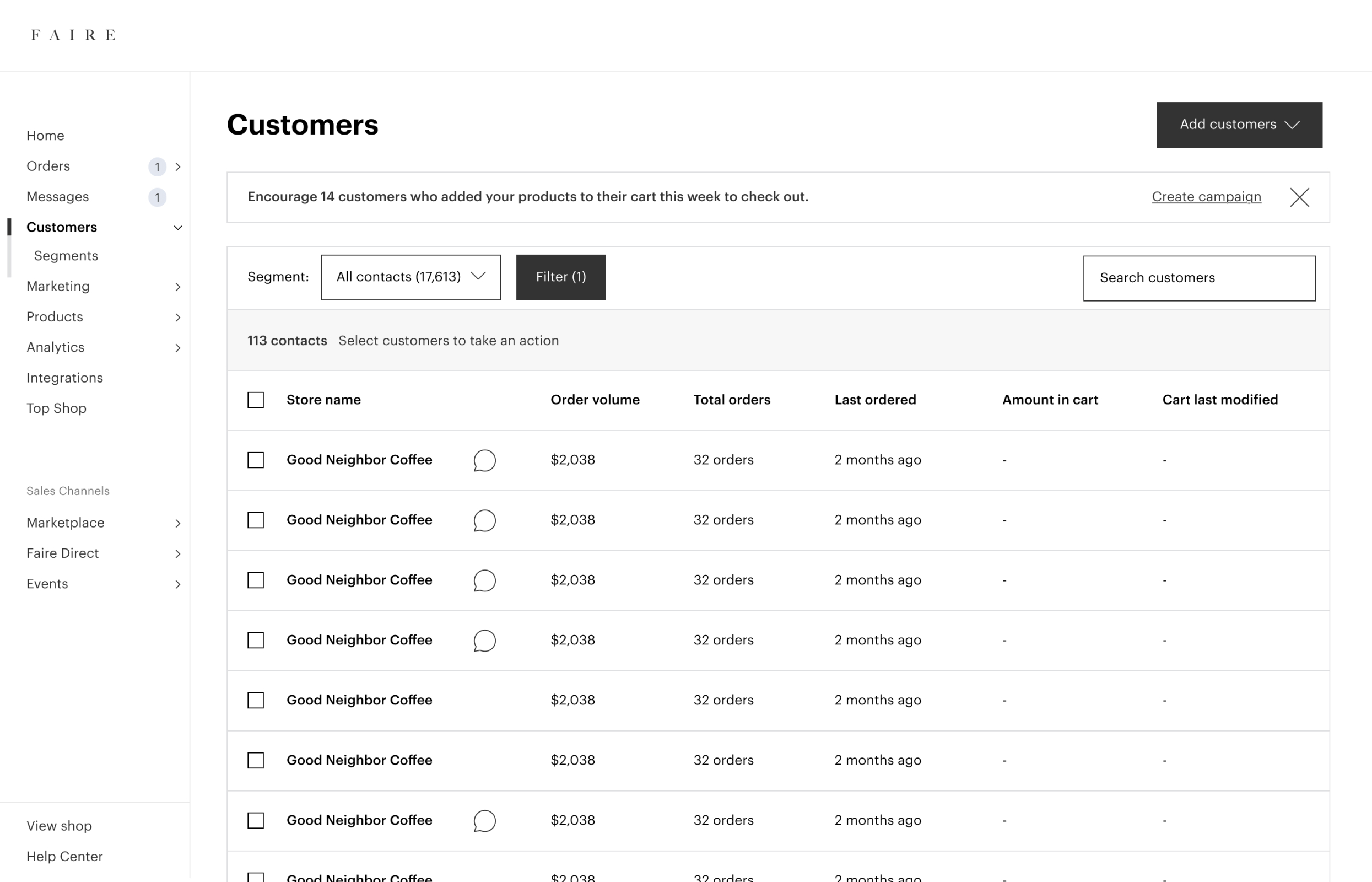
Project 5: Introducing order history filters
Now that we had a framework for filters and a more durable technical foundation, we could build some exciting new stuff. One of the top requests from brands was a filter that would allow them to market to their customers based on their order history.
One of the new order history filters.
We added the ability to filter by products purchased, and based on feedback from our account managers, included the ability to filter by whether a customer has not purchased an item. We also added the ability to filter by categories purchased using our product taxonomy tree.
We ran these new filters as an experiment and the results were HUGE. We had a double digit impact on one of our key metrics, and brands were thrilled with the update.
Project 6: Introducing custom tags
Finally, we built a custom tags feature, which would give brands a way to organize their customers however they wanted. In the old experience, we would have been wrestling with a lot of inconsistencies and design and tech debt to make a feature like this work. But this only took about a week to design because we now had a strong foundation and clear patterns to use.
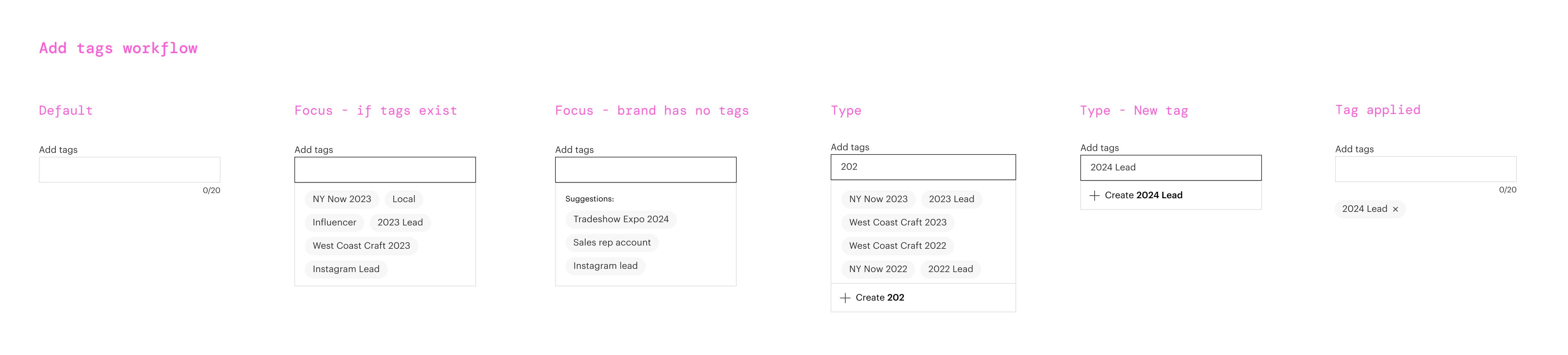
The new "add tags" component.
I designed an “add tags” component, which didn’t exist in our design system. We built filtering by tag, which would allow brands to create segments from tags, and added a table column so brands had the option to view which customers had tags in the customers table. I also designed a tool for adding tags in bulk from the customers table to help brands with tagging customers at launch. Finally, the customer detail would show all of a customer’s tags and would be a place where brands can manage tags on the customer level.
Unfortunately, we weren’t able to release this feature. It was about to ship, but then the company went through a shift in priorities and this work was paused.
Finals
The Customers tool with a simplified toolbar and visual design updates.
The new filters experience and a new entrypoint into creating segments.
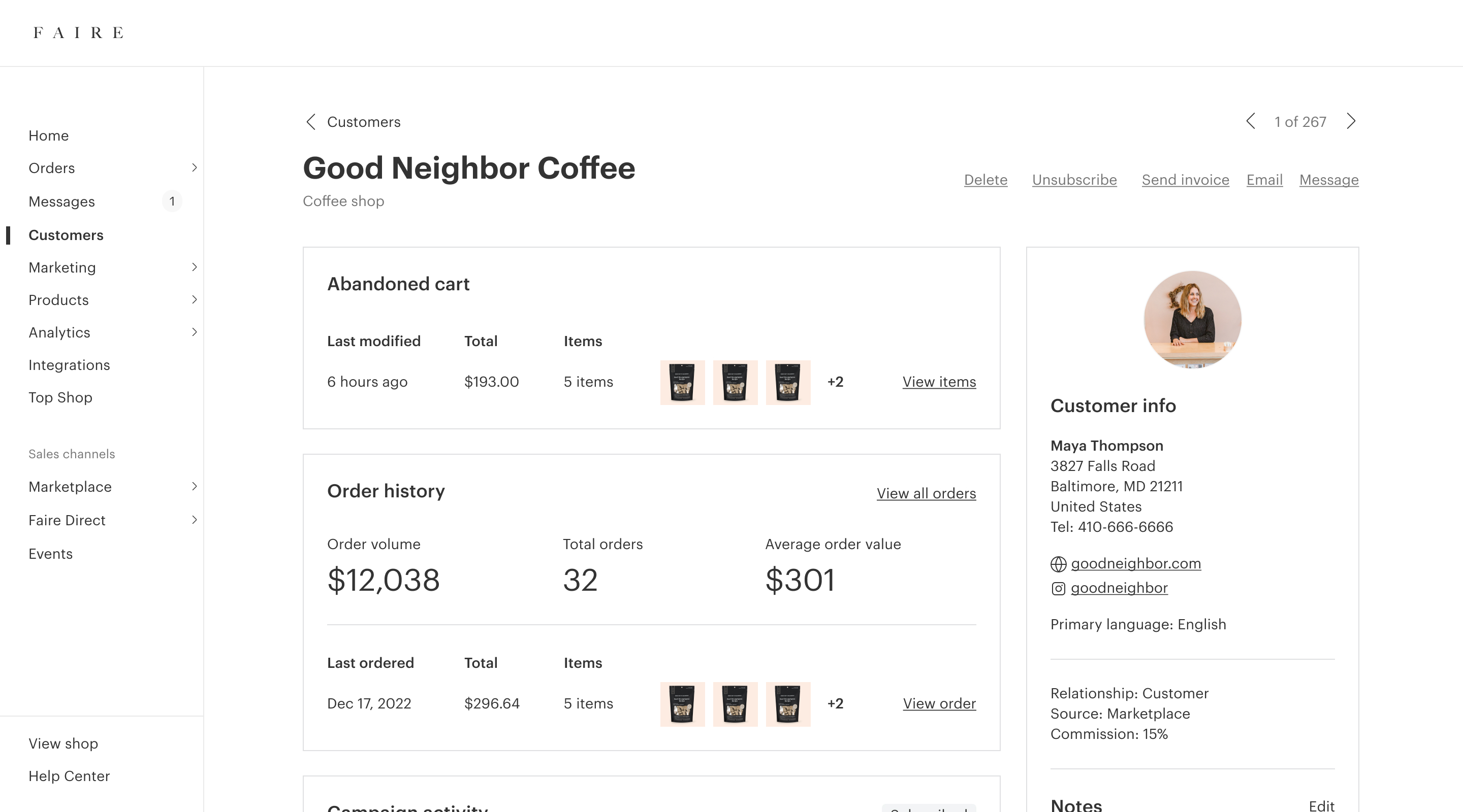
The refreshed customer detail with visual design and information architecture updates.
Reflections
This was a really satisfying body of work for me; it allowed me to think broadly, but then also execute on details. I also loved working on projects that impacted business metrics with better design, in addition to new features and functionality.
The six-month design vision was crucial for speeding up the design process, helping other teams understand where we were going, and for creating alignment on the long term. Having alignment on what we were trying to achieve in the longer term also helped us make better calls on experiments. I think without it, it would have been really hard to make the case to launch the filters update with a negative metric, or the dropdown experiment with a neutral metric.
Finally, even though company priorities shifted and we couldn’t release all of the updates we had planned, I’m glad that we broke the work down into a series of projects rather than doing one huge release. It got improvements into the hands of customers as quickly as possible, kept the changeset manageable, and provided us with feedback and insights along the way.
Project details
Role
Design and strategy
Team
1 product manager, 1 engineering manager, 6 engineers, 1 content designer, 1 product operations specialist, 1 customer support specialist, 1 brand success manager
Released
Q2–Q3 2023
View live
Faire brand portal (visible to logged-in brands only)