CSS at Etsy in 2014
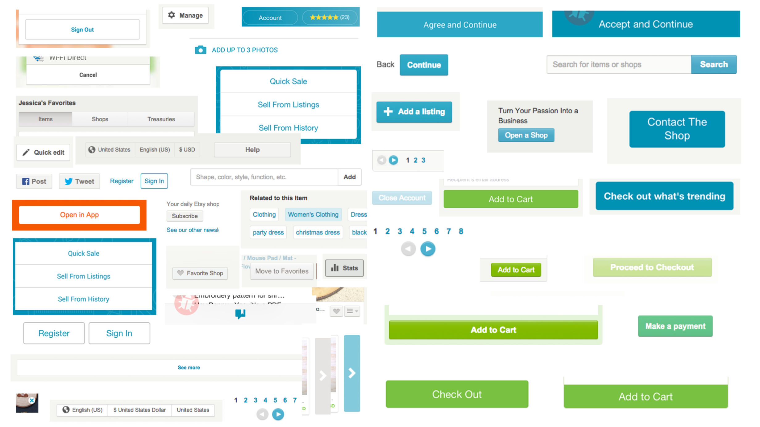
In January 2014, when I started at Etsy, designers and engineers were reinventing the wheel every time they wrote CSS. Very little CSS was actually reusable from page to page, and almost every component written was fixed-width. As a result, there was little consistency in the UI design from page to page (you wouldn’t believe how many different button styles existed), and people were spending a LOT of time writing CSS that was sort of similar but sort of different from what was already out there. Etsy’s style guides were barely followed, and the CSS across the site was a bit of a mess.

Every single button style on Etsy, circa 2015.
At the time, the larger design community was starting to talk about design systems as a necessity for any sizable design team. Bootstrap and object-oriented CSS had become incredibly popular, and design teams at companies like Salesforce and Mapbox had made their CSS style guides public. When I left Kickstarter in late 2013, we had also started experimenting with a more centralized set of CSS classes, led by Brent Jackson, so I had seen the benefits of a CSS style guide in action.
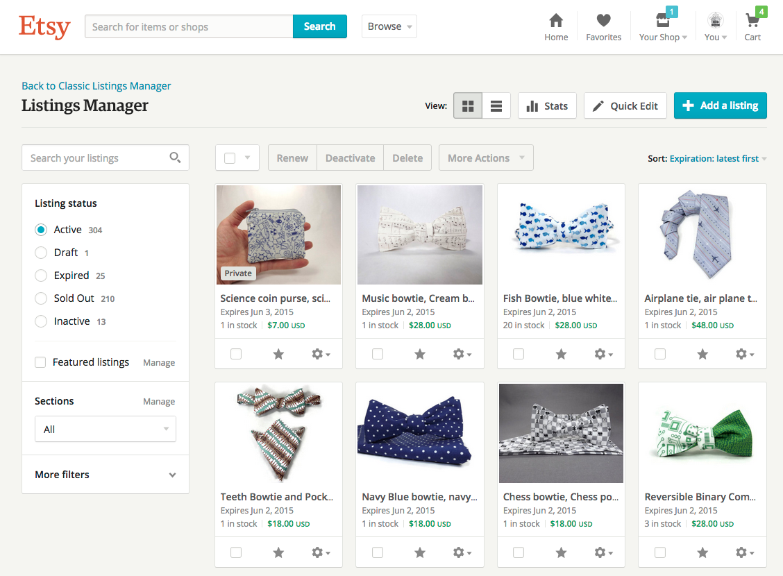
My team at Etsy was in the early stages of rebuilding one of Etsy sellers’ core management tools, the listings manager. In addition to rebuilding the web app from the ground up, the early designers on the team, Aaron Shapiro and Diana Mounter, also saw this rewrite as an opportunity to experiment with a new way of writing CSS. When I joined, the in-progress rewrite of the listings manager was using a brand new, fully responsive set of centralized CSS classes that Aaron and Diana had written. I eagerly joined in on their efforts to develop a living CSS style guide for the listings manager. Little did we know that two years later, this style guide would exist on every page of Etsy and become the go-to way of writing front-end at the company.
My role
I designed, developed, and documented components in Etsy’s web toolkit from 2014 until 2016, along with a small group of designers. This was work that we all did outside of our regular product work as a passion project.
During this time, I was also part of a core group of designers and engineers who maintained the web toolkit, including fixing bugs, reviewing pull requests, and socializing any major changes.
Most importantly, I was one of the main educators and evangelists of the web toolkit internally, and took on the work of training designers and engineers on how to use the web toolkit for their projects.
Because this work all happened on the side, I also acted in a number of other capacities, including project manager and working group facilitator.
How we created the web toolkit

The listings manager in 2015, powered by the very first version of the web toolkit.
The original CSS framework, or toolkit (as we called it), was developed alongside the development of the listings manager. As we found new UI elements that we needed, such as dropdowns, overlays, and form fields, we designed those elements, wrote and reviewed the CSS, drafted documentation, and then submitted a PR to the group to add it to the toolkit. This meant that our framework grew with and reflected the needs of the product. You can read more about the development of the listings manager here.
Aaron, Diana, Dennis Kramer, and I unofficially spent a small percentage of our time designing and building the toolkit itself, in addition to the work on the listings manager rewrite. We were all technically-minded designers, so we spent just as much time debating things like class naming conventions as we did on the design details of the elements themselves.

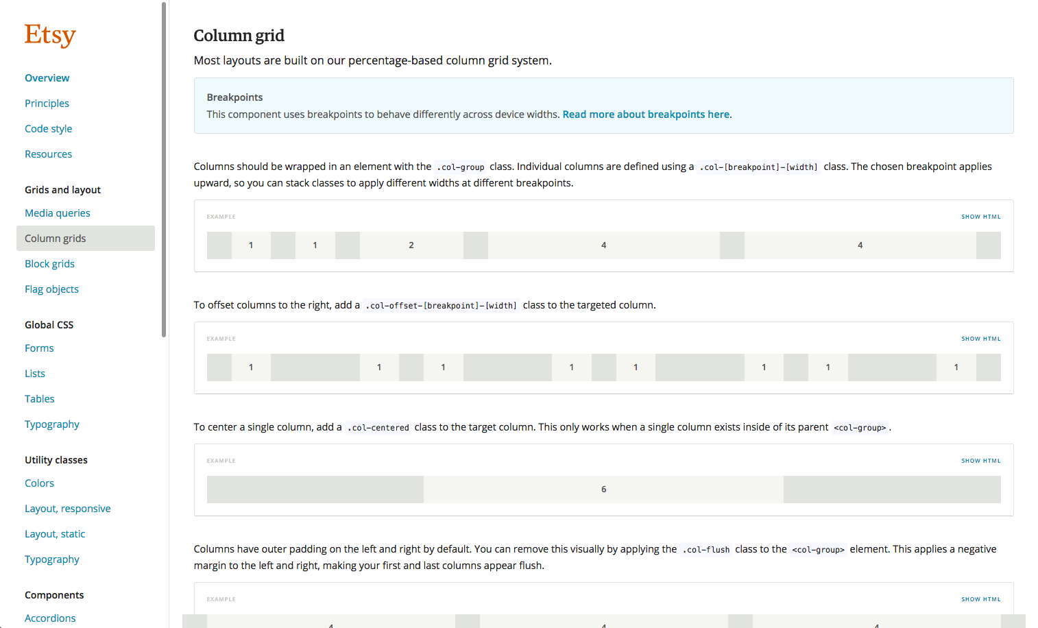
The web toolkit documentation, circa 2015.
At its core, the toolkit was a combination of components and utility classes. Components are UI elements made up of a collection of CSS classes that could be mixed and matched to create different variations on buttons, inputs, banners, and more. Utilities were small but mighty classes that were focused on doing one thing and one thing well, like making text a certain color or adding margin or padding. Everything was responsive and fluid by default. All of our patterns, decisions, and philosophies were captured in our documentation, so you could see every permutation of every pattern, as well as when and why they should be implemented.
At the time, we were only expecting that this CSS would be used by the listings manager; at best, maybe this framework could be adopted by other seller tools. It was such a departure from the way that CSS had been written at Etsy historically that it didn’t seem likely that it would scale further than our team. Luckily, the closer we got to code complete, the more attention our work began to receive.
Etsy’s front-end infrastructure team was especially excited that our team was writing modern CSS, and we ended up piloting the use of Sass at Etsy with the web toolkit.
Thanks to the listings manager and our robust documentation, design and engineering leadership saw the benefit of centralized, reusable CSS and asked us to make it possible for any team to use the web toolkit. Once we launched the listings manager, and with it, the first user-facing version of the web toolkit, our attention turned toward scaling the toolkit across the rest of Etsy.
How we expanded it across Etsy
Looking back, there were a few main reasons that the toolkit was widely adopted across the company.
First, it was incredibly easy and fast to use. Designers and engineers could spin up a new page that was fully styled and completely responsive in no time at all. Previously, we would allocate weeks to writing CSS. Now, writing the markup for a new page took under an hour, and you wouldn’t have to write any CSS.
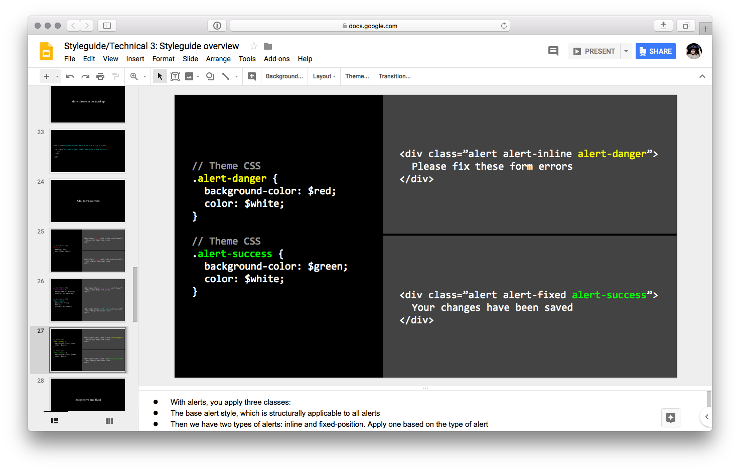
Second, we invested heavily in training for designers and engineers. If the web toolkit was going to become the way to build features on Etsy, we needed to get every designer and engineer at Etsy excited about it. After the listings manager launched, we went on a small roadshow promoting the web toolkit to designers and engineers across the company. We put together a presentation on how the toolkit CSS was written, our philosophy on writing CSS, and why everyone should use the toolkit. We had exercises we walked each designer through so they could practice building pages themselves to see how easy it was. And our engineering team created sandboxes that came fully loaded with the web toolkit so it was easy for designers to practice writing code.
It was also important to set the tone for new designers and engineers at Etsy that they should be using web toolkit. So we created training on the web toolkit for our designer onboarding program, and we all took turns running these sessions each time new designers were hired. For engineering onboarding, we created a web toolkit “code lab”, which was basically a series of exercises that engineers could go through to get started with the web toolkit.

A slide from our presentation on how to use the web toolkit. Training was key for web toolkit adoption, since it was a huge departure from how we wrote CSS at the time.
Third, we spent a lot of time on “internal advertising” to raise awareness of the web toolkit and its benefits. It wasn’t enough to just make the toolkit easy to use. People had to know about it and see it out there succeeding. Beyond our roadshows, we spent a lot of time talking to teams that were about to kick off projects, trying to convince them to use the web toolkit for their work. I remember spending one Etsy holiday party trying to sell a product manager on the benefits of the web toolkit; we were relentless. We also found a lot of key moments when people talked about their work, like launch emails, and made a point to highlight and congratulate people on using the web toolkit. We did live demos, lunch ‘n’ learns, and generally made a lot of noise. We were impossible to ignore.
The majority of the web toolkit’s success and adoption came from our ability to navigate Etsy’s internal structures and the strong relationships that our group of designers had. But there were also technical solutions that accounted for its success. We worked with our front-end engineering team to create a version of the toolkit that was scoped behind a parent class so that you could use web toolkit classes on a page primarily built with our old CSS and the styles wouldn’t collide. Even though a main selling point of the web toolkit was that it was responsive, we also created a version of it that was fixed-width. Most of Etsy’s pages at the time were not responsive, so if it was going to gain traction it also needed to work on our fixed-width pages. And finally, we spent a lot of time updating all of the old, page-specific CSS that existed across our core experience to look like the web toolkit so teams could use the web toolkit on an older page without it looking too out of place.
How we maintained the web toolkit
Eventually, so many teams across Etsy were using the web toolkit that we needed a maintenance process. This was a very good problem to have!
At this point, our regular contributors had evolved into a handful of designers and engineers. To create more structure and a clear set of owners, I helped form a Web Toolkit Working Group that was specifically focused on improving and maintaining the web toolkit. This was all work that was done on the side, as our primary responsibilities were still product features.
Our rituals were very similar to those of a regular product team. We had a Jira board to keep track of bugs and feature improvements we wanted to make. I ran standups each week where contributors could share progress and discuss who was working on what. We established an IRC channel and a Google Group that anyone could join to share pull requests and questions and report bugs. We had sprints, set quarterly goals, and sent launch emails. As the lead of the working group, I was part project manager, part design lead.
Since more people were using the web toolkit, we eventually needed more people to help maintain it. I reached out to a number of product designers and engineers individually when I thought that they would be good candidates for contributing to the web toolkit. I also ran a few web toolkit-focused sessions of our design team’s Design Bug Rotation to help more people grow accustomed to pushing web toolkit code.
As more and more product teams used the toolkit, they inevitably encountered issues that we never could have anticipated. To make sure that we were prioritizing the issues that were frustrating people the most, or even preventing people from using the toolkit, we frequently sent surveys to the entire design and engineering organizations to collect feedback.
You can read more about how I ran the web toolkit working group here.
How we know we were successful
Looking back four years later, I can say with confidence that the web toolkit has had a profound and lasting impact on the way that designers and engineers build features at Etsy.
- It’s easier for designers and engineers to collaborate, since they now have a common language (and design language) to do so.
- It’s sped up feature development time by an order of magnitude, since it almost completely eliminates all new CSS writing.
- It’s (nearly) eliminated situations in which designers reinvent the wheel.
- Making large-scale visual design changes across the site now takes minutes, not weeks, with all styles centralized.
- Engineers are able to make a lot of progress when building a feature without as much design oversight.
- Designers now have the space to focus on customer problems, product strategy, and user flows.
Today, the web toolkit exists on every page of Etsy. No new markup goes out without the web toolkit.
The creation of the web toolkit, its high adoption rate, and our working group eventually helped make the case for establishing a full-time design systems team. It was staffed with designers, a product manager, and engineers, and they are able to own the web toolkit full time and do things that our small group couldn’t have imagined possible.
Project details
Role
Design, front-end development, documentation, project management, working group facilitator, evangelist and educator
Core team
4 product designers (me, plus Aaron Shapiro, Diana Mounter, and Dennis Kramer) in the original core team. Later, a rotating group of designers and engineers were involved on a volunteer basis.
Years active
2014–2016
View live
While there are still remnants of the original web toolkit on Etsy.com, the majority of it has since been replaced with newer versions of Etsy's design system.