In 2017, we released an enormous update to the way sellers track their product inventory on Etsy by adding the ability to manage price, quantity, and stock keeping unit (SKU) for variations. This had been one of our top seller feature requests for years. These updates aligned Etsy’s inventory tools with the way that sellers thought about and kept track of their products. I was the lead designer.
Historical context
Sellers use a tool called variations to enumerate all of the options they have for sale of a given product; often, these variations are different sizes, colors, finishes, fabrics, or measurements that the sellers offers. For example, sellers might have one listing for a t-shirt in which the buyer can choose which color (red, blue, yellow) and which size (small, medium, large) they want to purchase. Color and size are the variations.
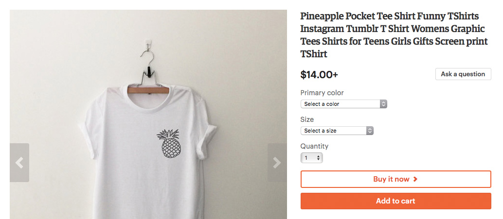
Primary color and size are the variations for this listing
Variations was initially launched on Etsy in 2012, and while it allowed sellers to easily specify their options, it didn’t fully line up with how sellers were keeping track of their items on hand. Sellers couldn’t specify the different quantities they had available for each version of their product; in the t-shirt example, a seller might have 2 red smalls, 3 blue mediums, and 0 blue larges, but we didn’t give them a way to indicate so. The quantity for the listing was uniform, regardless of variations. In other cases, the price of the item might dramatically change depending on which options a buyer selected (gold costs more than silver, diamond costs more than turquoise), but our tools for pricing variations were limited. While variations is an incredibly useful tool for listing items with different options, it was lacking the robust pricing and quantity tools sellers needed to really represent the items they had for sale.
Sellers were using a number of different workarounds to list their items. Instead of using variations, many sellers would have a listing for each version of their products (one listing for a red t-shirt, one listing for a blue t-shirt, one listing for a yellow t-shirt). This made it harder for buyers to understand the breadth of what a seller offered, and introduced more friction in the buying process. Some sellers would use variations but enter an inflated quantity for the listing, which often led to overselling and a very awkward conversation with a buyer. Other sellers would enter in a very low listing quantity to ensure that they wouldn’t oversell, which meant that they often had product sitting on a shelf that they weren’t selling.
Updating variations to have price and quantity tools was work that had started and stopped a few times at Etsy due to the sheer complexity; it required numerous back-end changes, coordination with the buyer experience teams, and touched the entire purchasing process. It quickly grew to become our top seller feature request in our regular surveys with sellers, and is a basic ecommerce feature that we were noticeably lacking. So, we entered 2016 deciding to solve the issue once and for all.
Our approach
We were lucky in that we had done many interviews with sellers about their inventory prior to the kickoff of this project, and had even done extensive usability testing in previous attempts at this work. We felt a deep understanding of the problem to solve, and the challenges were mainly around managing complexity.
We wanted to create a stronger relationship between the price, quantity, and variations fields, so we started by moving them together into a new section of the listing form called “Inventory and pricing”. This would be especially helpful as price and quantity were growing in complexity.
Many of our higher volume sellers were already using a SKU system (basically, unique product identifiers) to keep track of their inventory, so this seemed like a good opportunity to add SKU as an optional new field in the inventory section. If sellers used SKUs, we would include them in the order receipt to help the seller identify and find the item in their studio space.
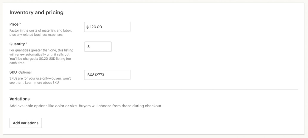
We had seen from previous research around inventory that many sellers track their item quantities in spreadsheets, and thought that served as a good mental model for how to think about the new interface. The existing interface for variations was a very simple table, and we could build on that to add columns for price, quantity, and now SKU as they applied.
There were two components to editing variations in a world with better inventory management: the initial set-up of the variations (entering all of the options), and the management of the prices, quantities, and SKUs of each individual option (such as restocking or making price adjustments). A lot of exploration had been done by previous teams around the initial entry of the variation options, which we were fortunate enough to build on.
The initial setup was done in an overlay on the listing form. Sellers selected which variation type applied to their item (such as color), then listed out each of the options (red, blue, yellow). After entering up to two variation types, they could define whether they wanted to manage prices, quantities, and/or SKUs through variations. When they were done in the overlay, we’d populate a table showing all of the options for their product. From there, the seller would enter the item’s prices, quantities, and/or SKUs. This meant that when sellers came back to the form later to update prices or change quantities, the main focus would be on the inventory table. Any edits to the options could happen in the overlay.
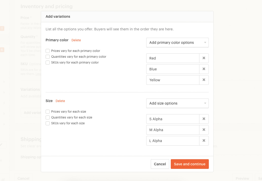
The overlay where sellers enter all of their variation options
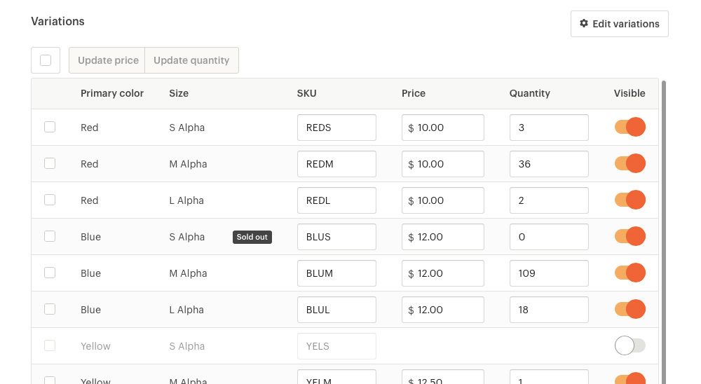
A table where sellers manage prices, quantities, and SKUs for their variations
Creating the inventory table was going to be fairly complex for a few reasons. First of all, we needed to support legacy variation features at launch without sellers making any adjustments to their listings. We didn’t want to make any assumptions about price or quantity on sellers’ behalf, so we needed to be able to port a seller’s setup from the old to the new variations system without any impact on their listings. This meant that we couldn’t assume that every inventory table would be a cross-product of the two variations. The old version of variations supported up to two variations, with an option to have unique pricing on only the first variation. In that scenario, the second variation served more as data collection from buyers, rather than something that affected price.
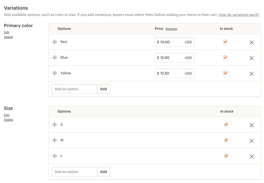
The old version of variations, which doesn't allow for a relationship between the two variations
A huge consideration was that Etsy is a marketplace for unique goods, many of which are made-to-order or customized for the buyer. This meant that we had many different use cases that we needed to support that weren’t always going to be as simple as the t-shirt scenario. One example of this is a seller who designs coffee tables. One variation would be the dimensions of the table, and the price of the table and available quantity change based on the size. This seller could also have a variation in which the buyer selects the stain for the coffee table, and the stain is applied after the item is purchased. In this scenario, the stain is a made-to-order feature that has no impact on price or quantity. So, we wouldn’t want to create the cross-product of dimensions times stain, since they don’t have an effect on one another.
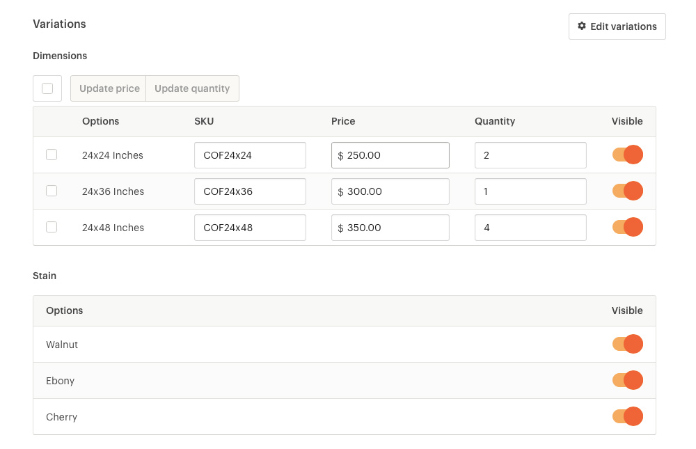
Two variations with no effect on one another, since it's made-to-order
This meant that we had to support both separate inventory tables (one for each variation) or one mega table that was a cross-product of the two variations. It also meant that price and quantity didn’t always go hand-in-hand, and we’d want to be flexible enough to support any combination of price and quantity on each variation. In total, there were sixteen different scenarios that we supported for inventory tables.
But how should we let a seller choose what style of table they needed? What was the best way to ask a seller to describe their inventory, and the relationship between their different options, and how they priced their items and managed quantity? To figure this out, we relied heavily on usability testing.
We were pretty stumped on how to ask sellers which of the 16 scenarios their item fit into in a simple and straightforward way. So we put a few really rough ideas out there as a way to get a reaction and to see what kind of vocabulary sellers were using. After entering in their variation options, we’d take them to a second step of the overlay if they had two variations. We tried asking if they needed separate or combined inventory tables as a way to get at the relationship between variations. We tried illustrating items to demonstrate different scenarios, and then tried illustrating different interfaces to demonstrate the impact of their selection.
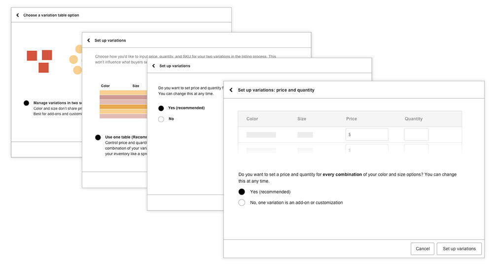
Some different approaches that we tested with sellers to understand their thinking
The questions that we were trying to ask were much too focused on our interface, and not on the item itself. The real thing that determined which table we gave a seller was the relationship of price and quantity to each variation: do prices vary for each color? Do quantities vary for each color? If, say, price is impacted by both variations (such as metal and gemstone), then we create the cross-product so a seller can enter in the unique price for each combination. Ultimately, we decided to add checkboxes to each variation in the overlay with the option to select whether price, quantity, and SKU needed to vary. Based on the selection, we’d generate the appropriate table.

With price checked for both variations, we'd create a table with cross-products
Another challenging part of the interface was how to handle the inventory table on smaller screens. At its most complex, the table could have 7 columns, and a table with cross-products could have hundreds, even thousands of rows. For mobile web, we looked to mobile spreadsheets as a guide for how to handle the table, and decided to side-scroll any overflowing columns. Rather than leave the cells as open inputs, which could be easy to fumble around on a phone, we built them to be tap-to-edit, which also allowed us to tighten up the spacing. On native phones, we offered two ways to edit the data: by “table row” (edit all of the metadata for one option) or by “table column” (edit all of my prices).
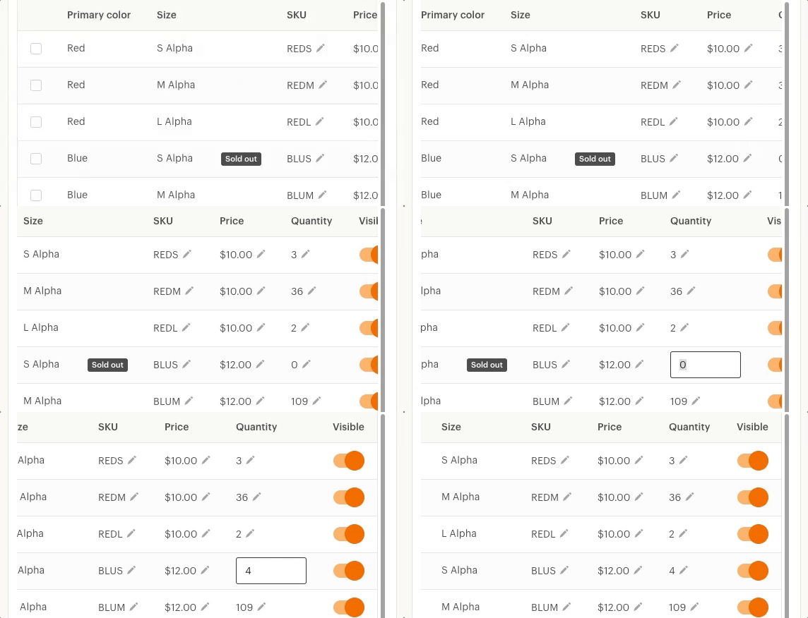
Adjustments to the inventory table at smaller screen sizes on web
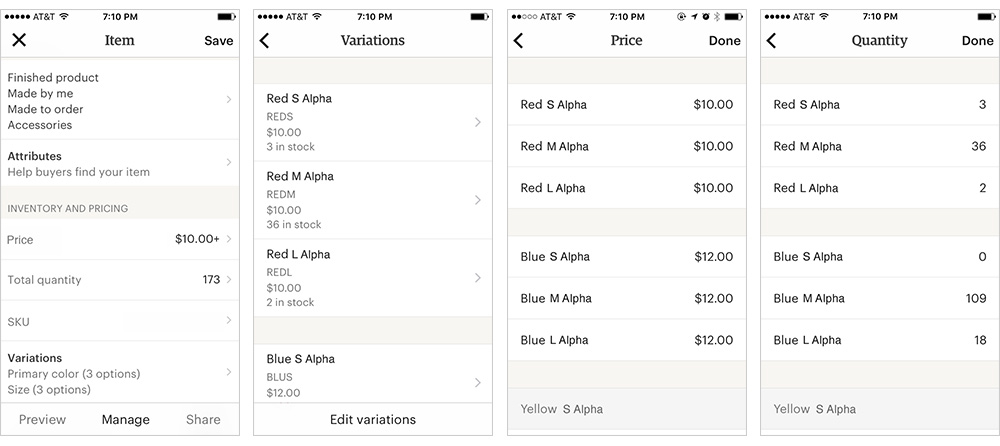
On native, either edit all prices or quantities at once, or edit all metadata for a given option
Any change to the seller side of listings includes a change to the buyer side of listings. This work meant we had to make some small changes to the way that we were showing buyers available quantity and item prices. We worked closely with our expert buyer experience designers to think through all of the interactions for selecting variation options, communicating prices based on selections, and communicating states like sold out for a given combination of options.
Gaining confidence and launch
In August 2016 we had end-to-end updates to variations complete, so we invited our first batch of sellers to a closed prototype group to begin testing out the new features. We targeted sellers who were already using variations and even invited sellers who had been requesting these features in the Etsy forums. The prototype group lasted for six months and was incredibly valuable for fixing issues and soliciting feedback. By the time we fully launched in February, we had thousands of sellers participating in the prototype group.
For launch, we targeted in-product marketing at two groups of sellers: existing variations users who would be interested in the enhancements, and sellers with a high number of duplicate listings, who we think would benefit from the new variations tools. We collaborated with our brand design team on photography to use in an in-product tour, social posts, and targeted emails. Rather than show screenshots of the interface, we used photography to talk about the feature in terms of items by showing off items that were similar and could benefit from variations.
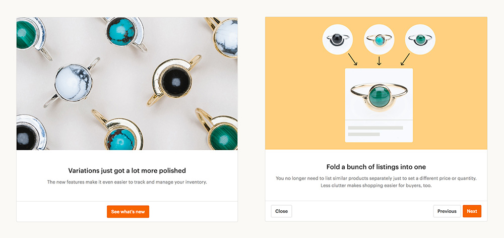
Screens from the in-product tour for the launch
I even got to be a hand model for part of the shoot!

This is my hand
Sellers were happy to finally be able to accurately track their item quantities and combine their items into fewer listings for a better buyer experience:
“These new tools are encouraging me to list more items with variations knowing I have the tools for buyers to make their personal selections… I could combine all 4 listings and offer all 8 card variations in just one listing—now that’s cool.”
“Thank you so much for this! I was considering ceasing the adult sizes in my store, because there was no simple way to keep track of sizes without having separate listings”
“This has really saved me time. I tried to add clear information that only one skein was available of each length. A few customers missed that and would order 2 or 3 of the same single skein. With the quantity number available for each different length skein, I will be set. All the information the customer needs will be readily available and no possibility for error.”
Project details
Role
Lead designer, front-end development, hand model
Core team
1 product manager, 1 engineering manager, 7 engineers, 1 product marketing manager, 1 product education specialist
Early concepts and research: Dennis Kramer, Kyle Turman
Released
February 2017
View live
Listings Manager (for Etsy sellers only)