In 2014, we redesigned the core of Etsy’s seller tools, the Listings Manager. The Listings Manager is where Etsy sellers edit and organize all of the listings in their shops. Sellers use it to add and edit listings via the listing form, modify large quantities of listings at once with the bulk editor, and make small one-off changes with a quick editor.

The listings manager design when we started this project.
It had been years since there were major updates made to the Listings Manager and its age was showing. The interface had become cramped from multiple teams adding features over the years. It also wasn’t designed with workflows in mind; these new features tended to occupy subpages of the Listings Manager instead of being integrated into common seller flows. It wasn’t mobile-optimized, either, despite increasing mobile traffic to Etsy.
The Shop Management team at Etsy embarked on a year-long journey to rebuild the Listings Manager from the ground up. We rethought the interface and workflows as well as the technology behind it. Knowing any work we did would be a huge change for sellers, we made it a goal of the project to get what we were building in the hands of sellers as soon as possible.
The original listing form when we started this project.
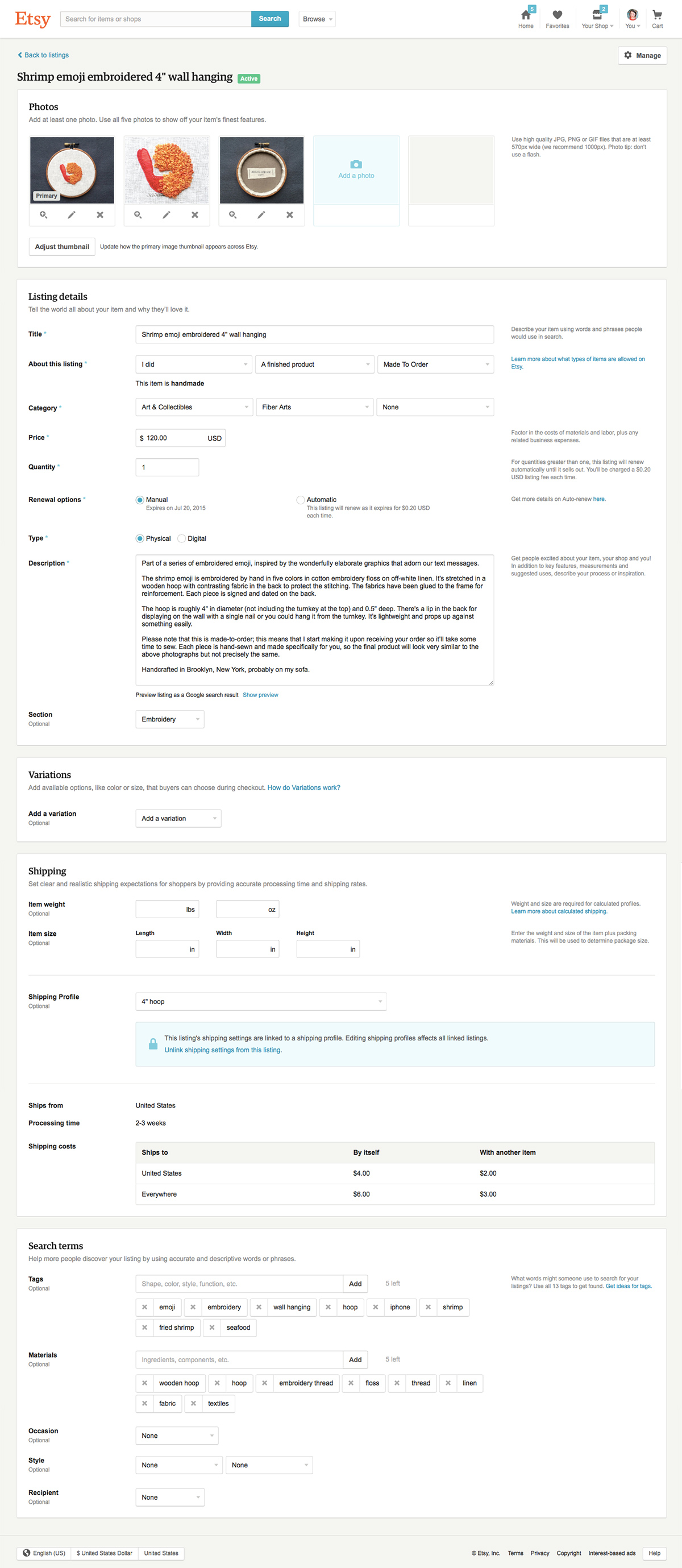
The part of the Listings Manager that I focused on was the listing form. The listing form had all of the same problems as the listing manager, plus some problems of its own. The information architecture of the form fields was difficult to make sense of; there wasn’t a clear narrative from the top of the page to the bottom. There were a lot of fields, but it was unclear which were necessary to fill out. Anecdotally, it was also taking sellers a long time to add and edit listings; we often heard from sellers that they were spending valuable time that they wanted to be making their items on managing their shops.
A wireframe of the reorganized listing form.
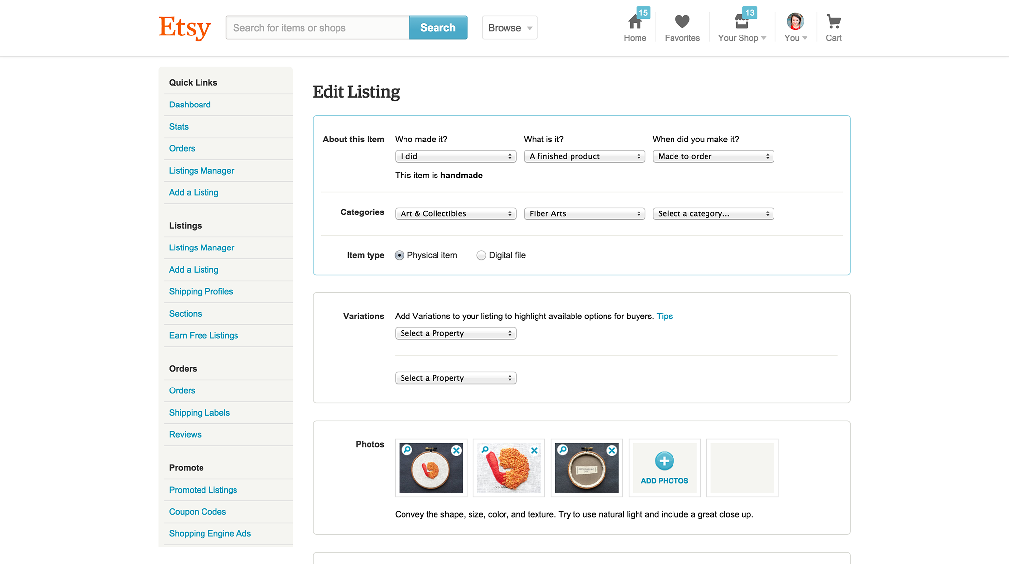
The listing form wasn’t the same for every listing on the site; there are many types of listings on Etsy, and the form had to accommodate all of the edge cases. One of the first things we did was take inventory of all of the possible states: physical item, digital download, retail-only, wholesale-only, retail and wholesale, allows for translations, allows for manufacturers, et cetera. We organized the form fields so that the more consistent, fundamental fields were at the top of the page, and then as you went further down the page, the fields became more specific to the type of listing. We also added clear section headers to each grouping of fields to expose our method of organizing.
Reorganizing the form was the first step of many to make it faster to update listings. We labeled every single field with whether it was required or optional; previously we only indicated when a field was optional. We organized the content into three columns on desktop to make everything scannable: one column on the left for the field label, one column for the form elements, and a column on the far right with any instructional copy. To minimize scrolling, we fixed the form controls in a bar at the bottom of the viewport so the preview and publish buttons were always accessible. Finally, we made a previously required preview step optional to save sellers a page view every time they went to update their listings.
The updated listing form design.
Once the design of the new form started to take shape, we began regular remote usability testing sessions with sellers. Every few weeks for six months, we put HTML prototypes in front of sellers and got their input on everything, including copy, form organization, image editing tools, and more experimental ways of editing the listing form. These sessions kept us on track and focused and were a constant reminder of the needs of the people for whom we were designing.
The web toolkit that powered the updated listings manager.
One of the many great things about working in HTML prototypes was that they were a foundation for the engineering team to build on top of and allowed us to work in parallel. Typically, as we were building out a feature, I would provide a rough static prototype in HTML to start. The engineering team would wire it up, and then I would clean up the spacing or typographic hierarchy. The Listings Manager was built using a responsive and fluid CSS toolkit that we created in-house using component classes and utility classes. This toolkit made prototyping and tweaking the design painless. It also provided the engineering team with baseline design guidelines so they were less dependent on high-fidelity mockups. In the end, we only ended up writing a few dozen lines of page-specific CSS for the listing form. You can read more about the creation of this toolkit here.
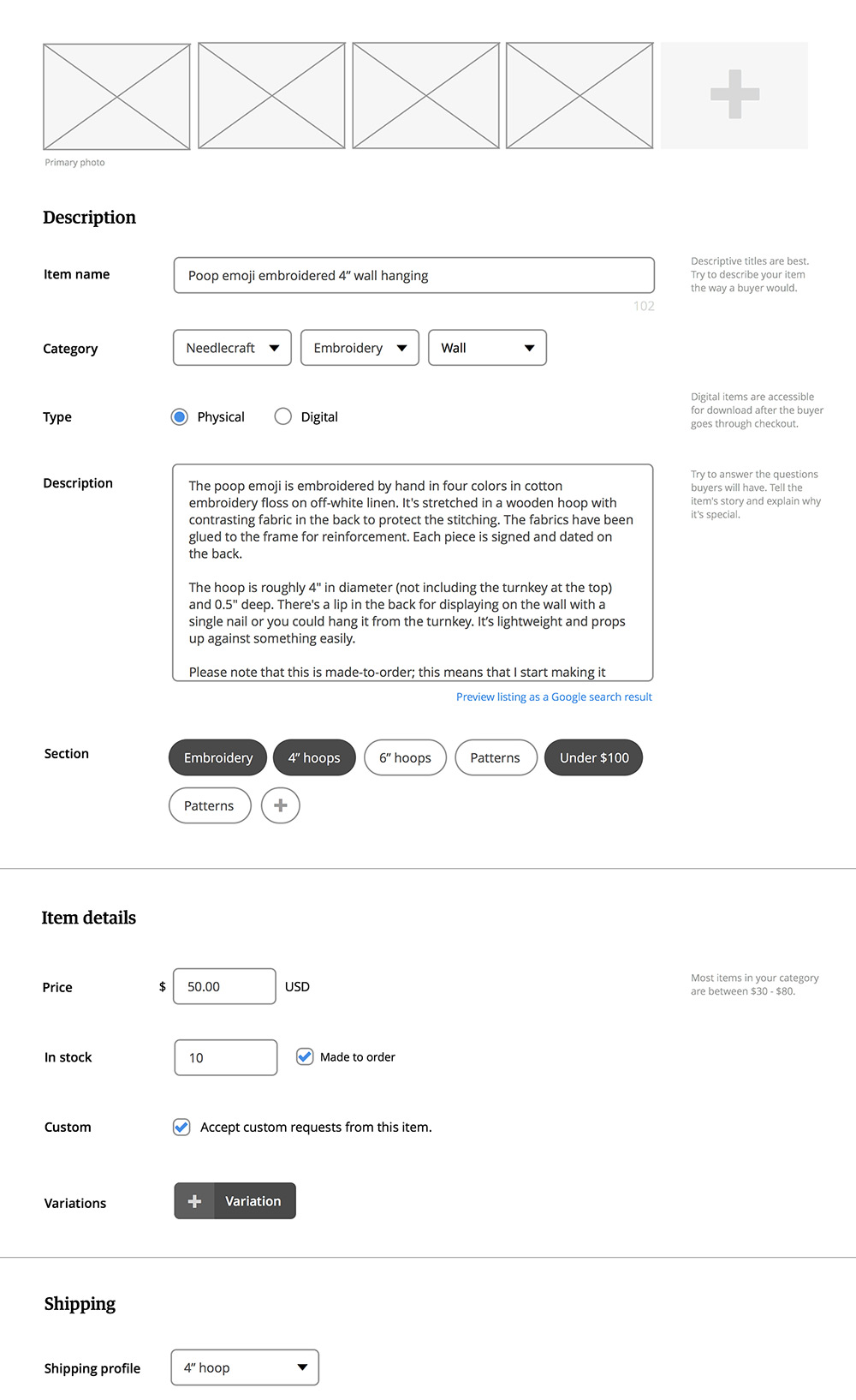
The final listing form design that we launched.
After we had spent six months refining the Listings Manager and listing form, we launched to an invitation-only Etsy prototype group of 50 sellers. Prototype groups are one way that we beta test concepts and new features on Etsy; buyers and sellers can get early access, test everything out, and provide us with feedback. At this point we hadn’t hit feature parity with the old Listings Manager, but we wanted to get sellers using the new tool as soon as possible. Over the course of another six months we invited more and more sellers to join the prototype group while we were also releasing features and improvements to the Listings Manager. The sellers in the prototype group helped us find bugs, pointed out weak or confusing spots, and provided feedback on the new workflow. We kept track of pain points that were bubbling up and turned those into small design and engineering tasks. The Listings Manager became a much more stable and easy-to-use product as a direct result of the feedback we received from the prototype group.
“A big thank you to Etsy for being so responsive to prototype team members! I’m pleased that the careful process was used to test and refine the Listings Manager, and that fine tuning was implemented when team members had valid concerns. There are still times when I prefer to use the classic version, but the new Listings Manager is a good step forward.”
“I’m a fan I’ve been using it since the prototype. Glad to hear the initial implementation will allow for shop owners to opt in. If you haven’t gotten to use this yet opt in and start trying it out so you get used to the changes while you can switch back and forth.”
“I’ve been using it for a while and always use it now. In the beginning I would switch back and forth until I got used to it, now it’s all I use!”
When we had hit 10,000 shops in the prototype group, we were ready to announce the new Listings Manager to all sellers and let them opt-in to the experience. We added an opt-in banner to the old Listings Manager, emailed every active seller, and posted the news in Etsy’s forums. The response was overwhelming. Many of the sellers who were a part of the prototype group hopped in the forums to declare their approval. They were even teaching other sellers how to use the new Listings Manager and defending the decisions we made. We smoothly launched something that sellers wanted to use thanks to how closely we had worked with thousands of Etsy sellers.
Project details
Role
Design, development
Team
4 designers (me, plus Aaron Shapiro, Diana Mounter, and Dennis Kramer), 2 design leads (Cap Watkins and Jason Huff), 2 product managers, 2 engineering managers, 7 engineers, 1 user researcher, 1 data analyst, 1 product education specialist
Released
February 2015
View live
Listings Manager (for Etsy sellers only)
Read more
Rebuilding the Foundation of Etsy Seller Tools (Code as Craft)
How 10,000 Sellers Helped Etsy Develop New Tools (Etsy blog)